B A T T L E F I E L D 2 0 4 2 I N T R O
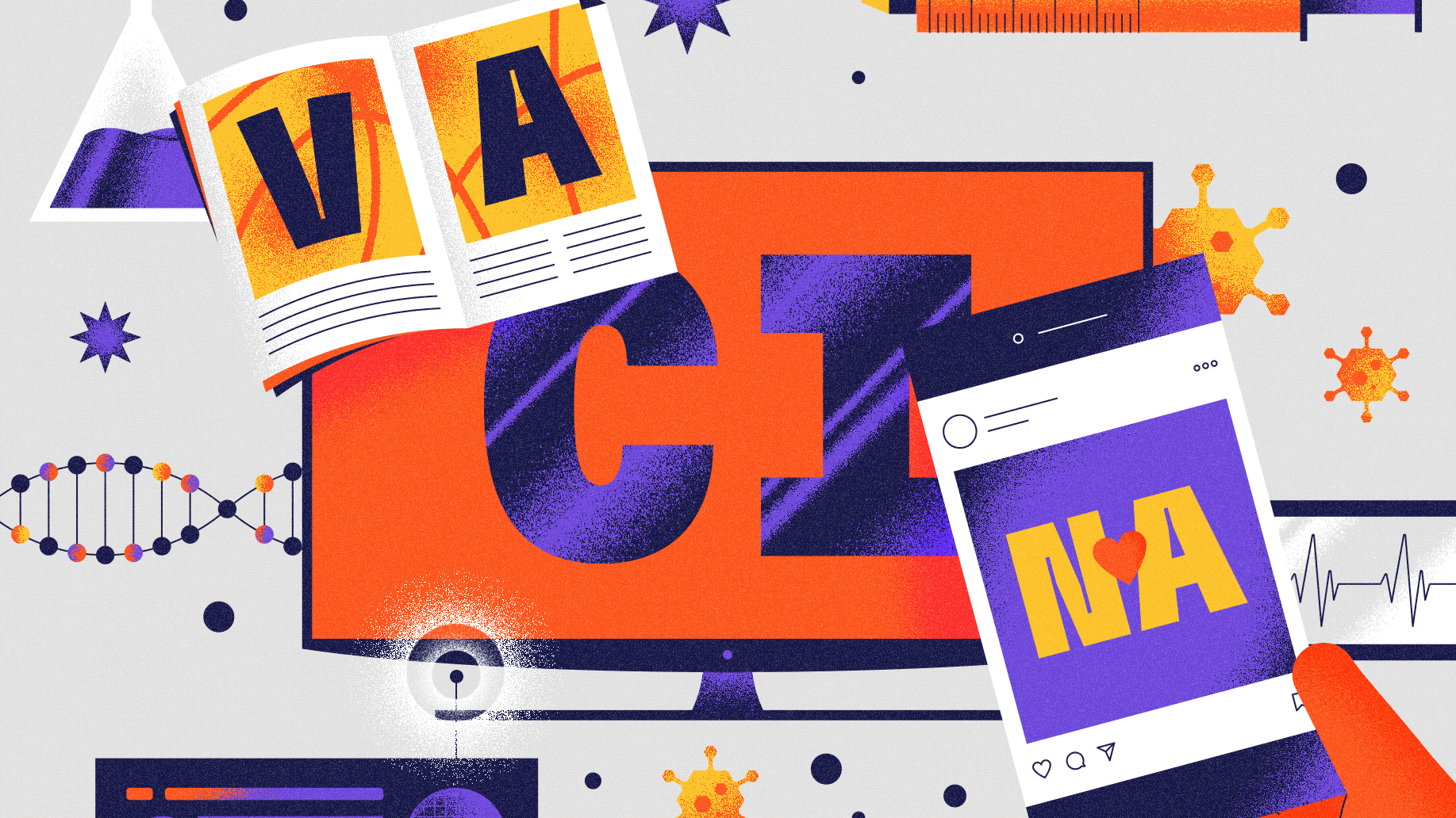
Part 3 of our case study explores the interface and map development from the film. UI and typographic elements were important visual devices used to convey key story points and to create a graphic textures throughout the film. These elements help carry the narrative as it progresses forward through time, providing date markers in the form of news headlines and supporting content nested throughout the digital environment.


____
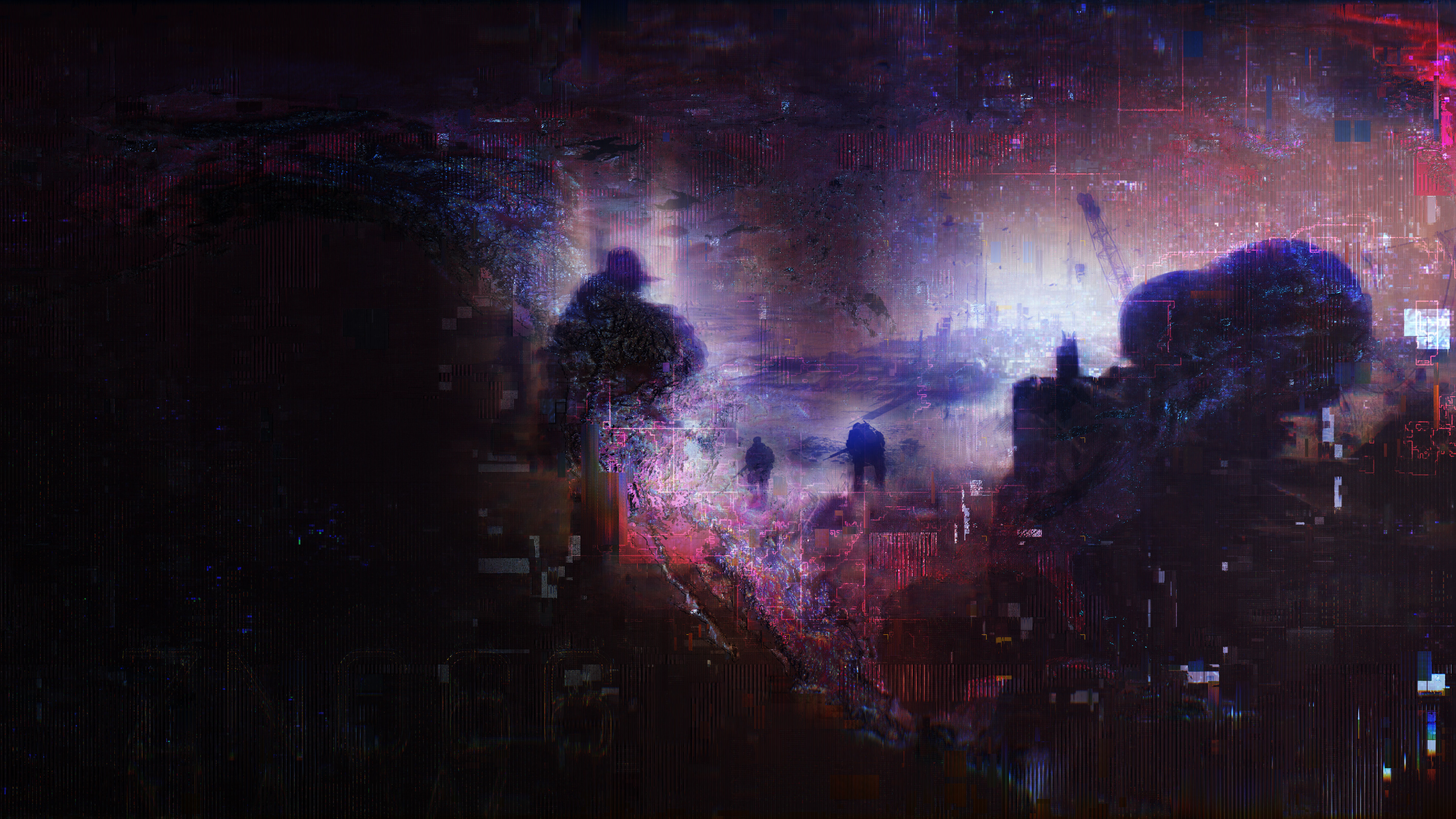
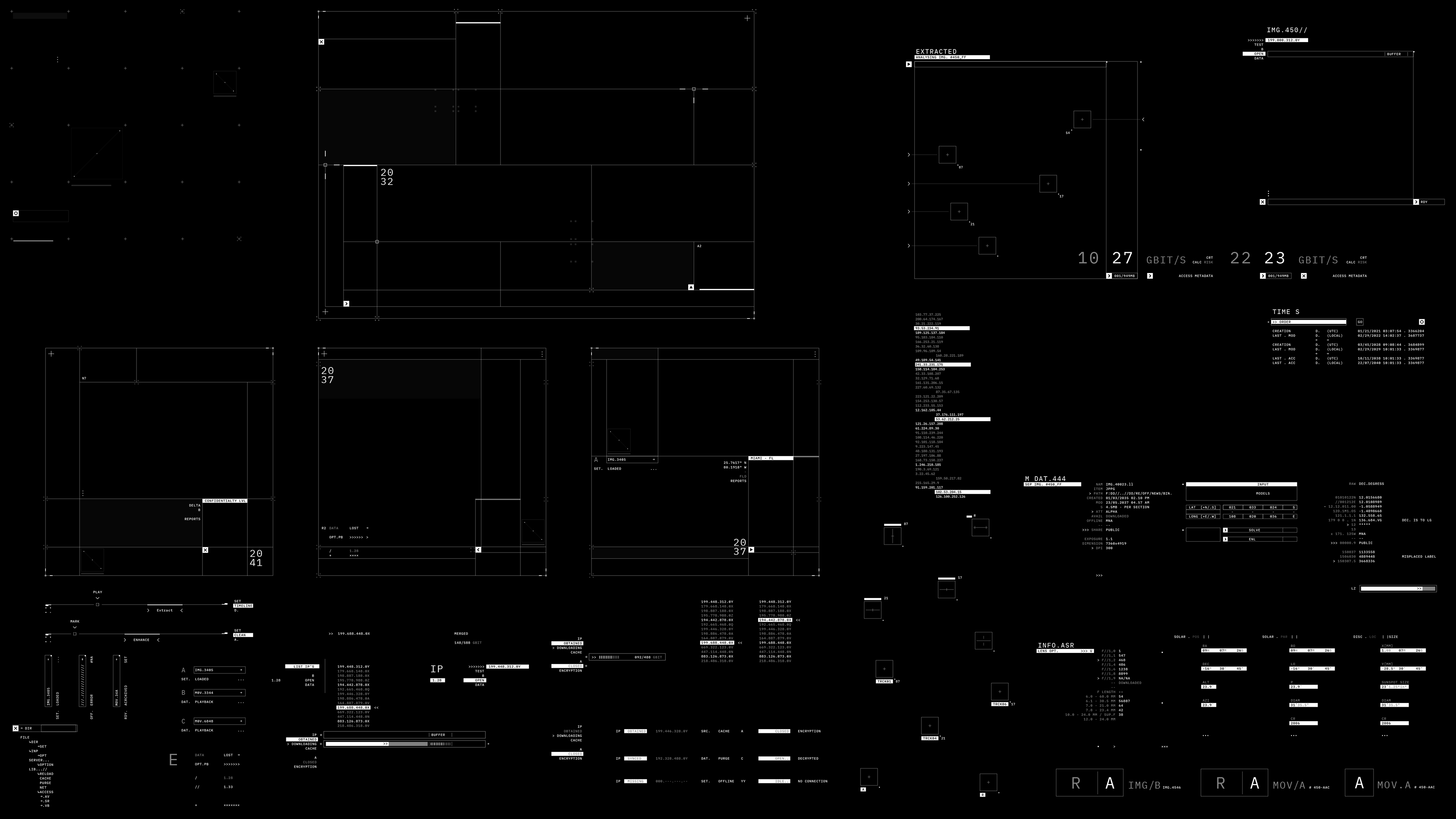
INITIAL INTERFACE DESIGN
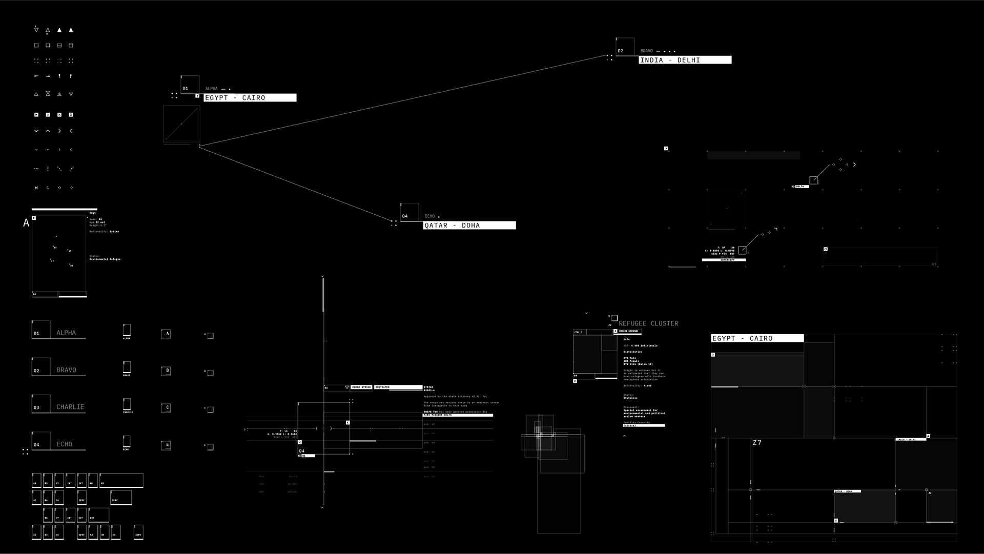
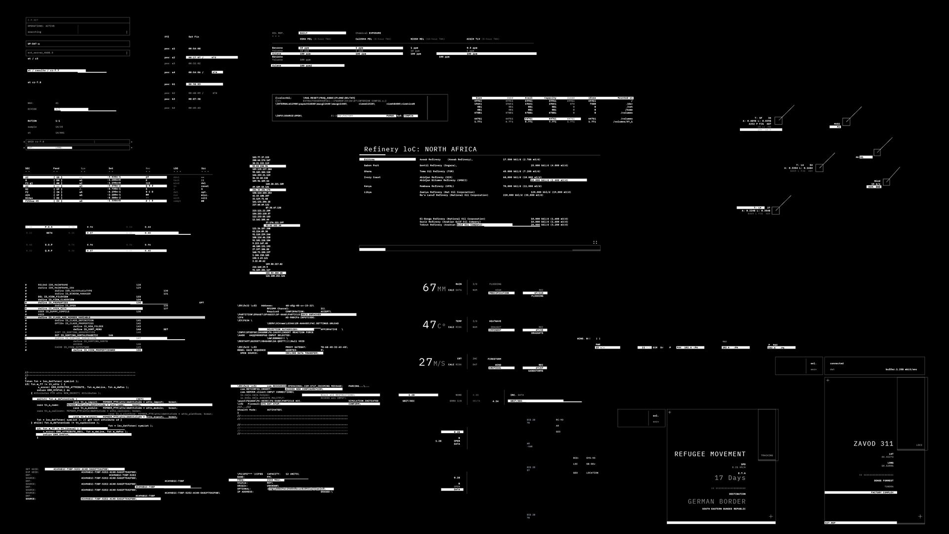
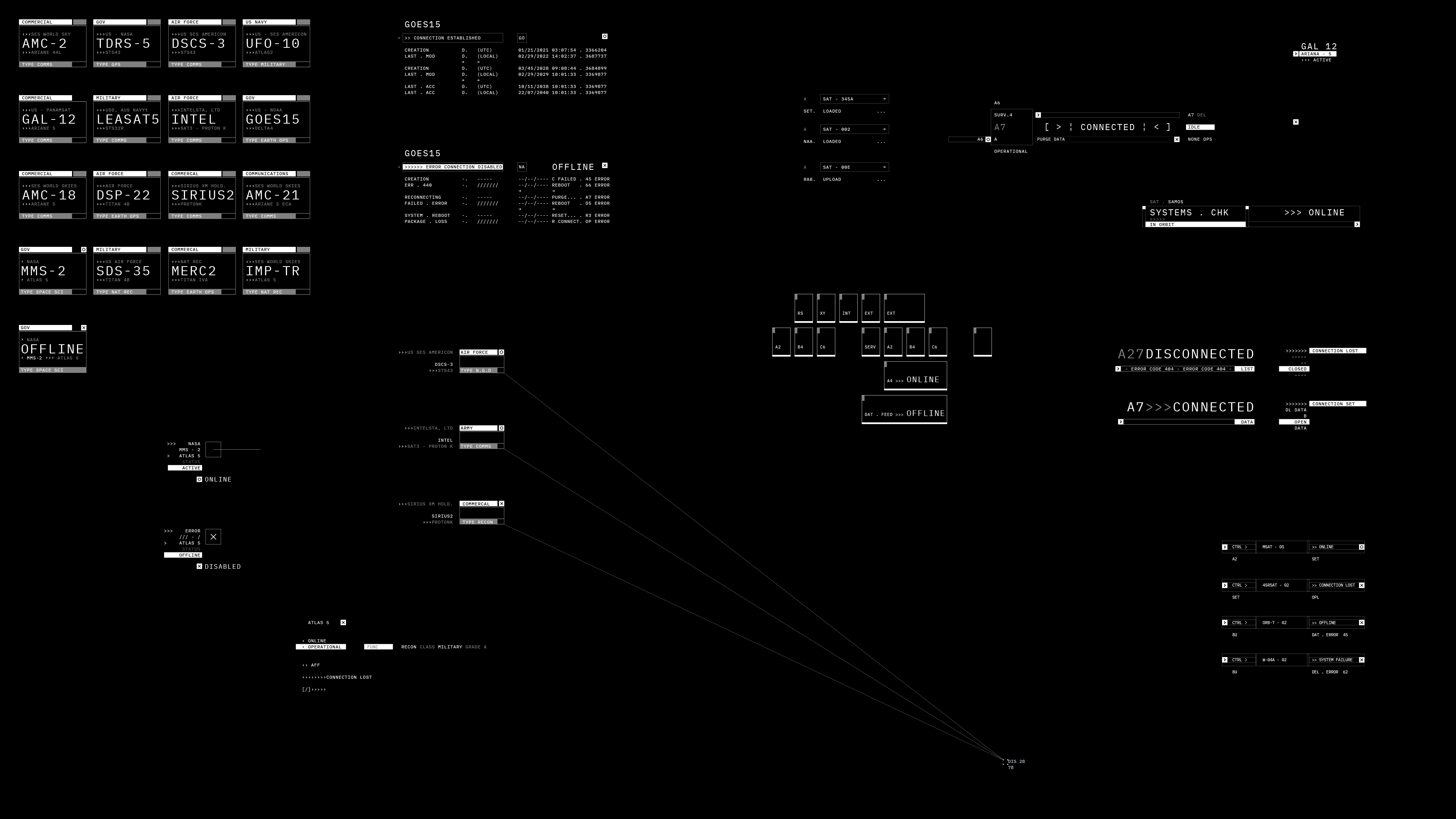
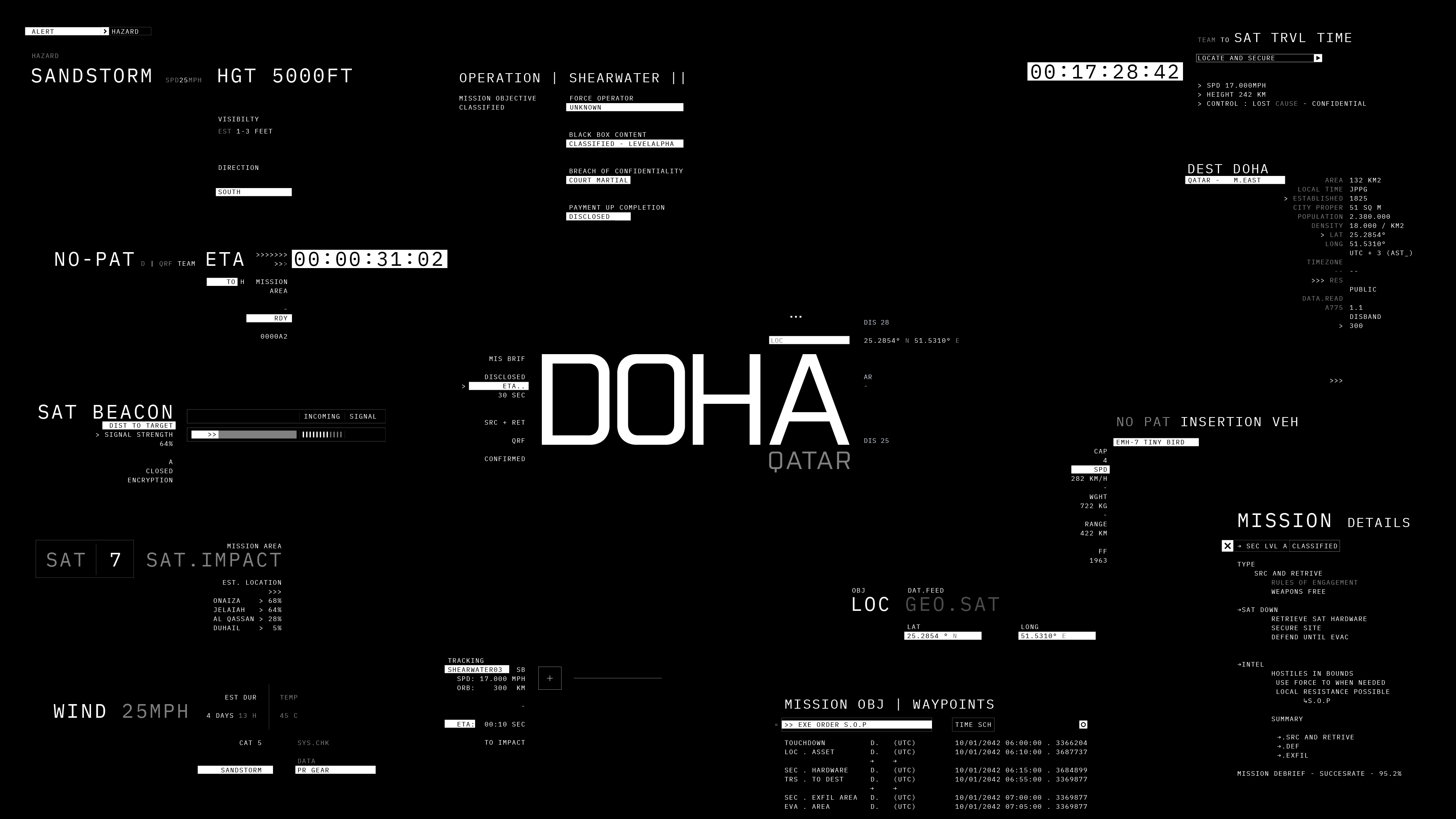
The interface and graphic systems needed to be flexible enough to accommodate a wide variety of visual information. We incorporated everything from basic grids and terminal data to intricate map overlays and military intelligence information. This required a sophisticated hierarchy to create legibility and cohesion within our complex visual ecosystem.
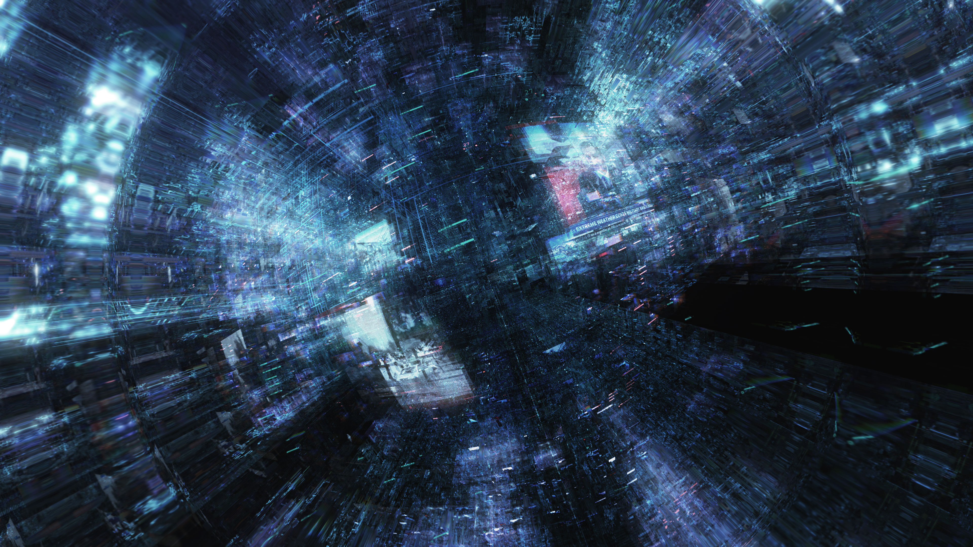
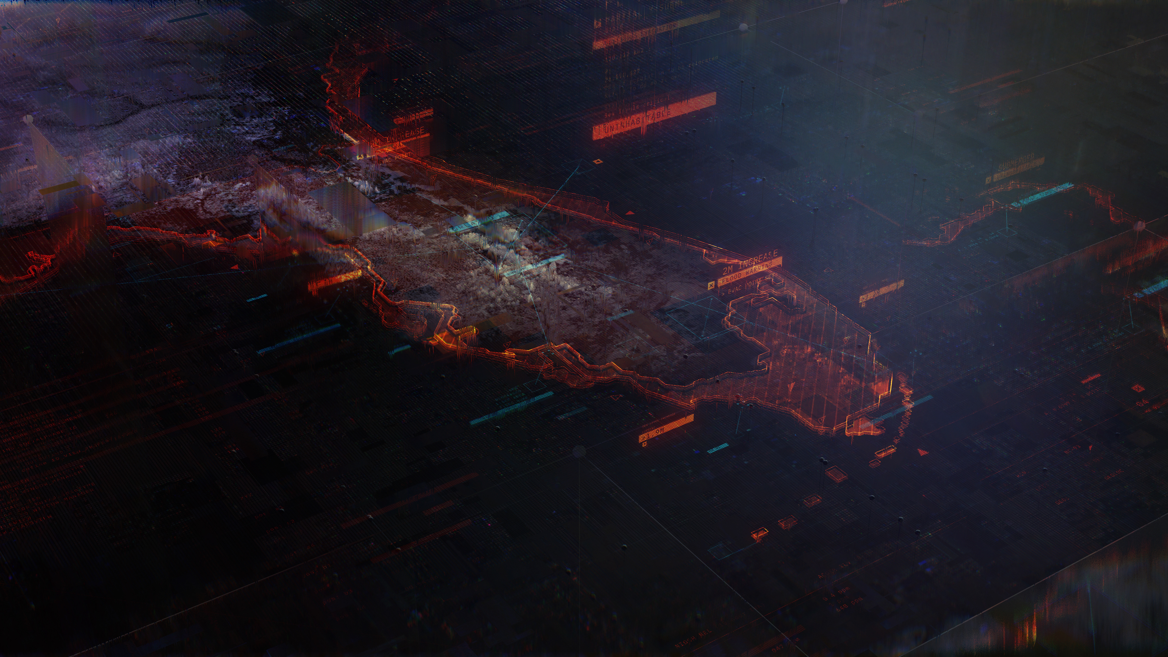
We started with command-line and terminal interfaces as our starting point and built out our graphic system from there. We wanted to develop an interface that could both dissolve into the glitch textures as well as become the primary focal point of the shot, carrying key story points.
____


____
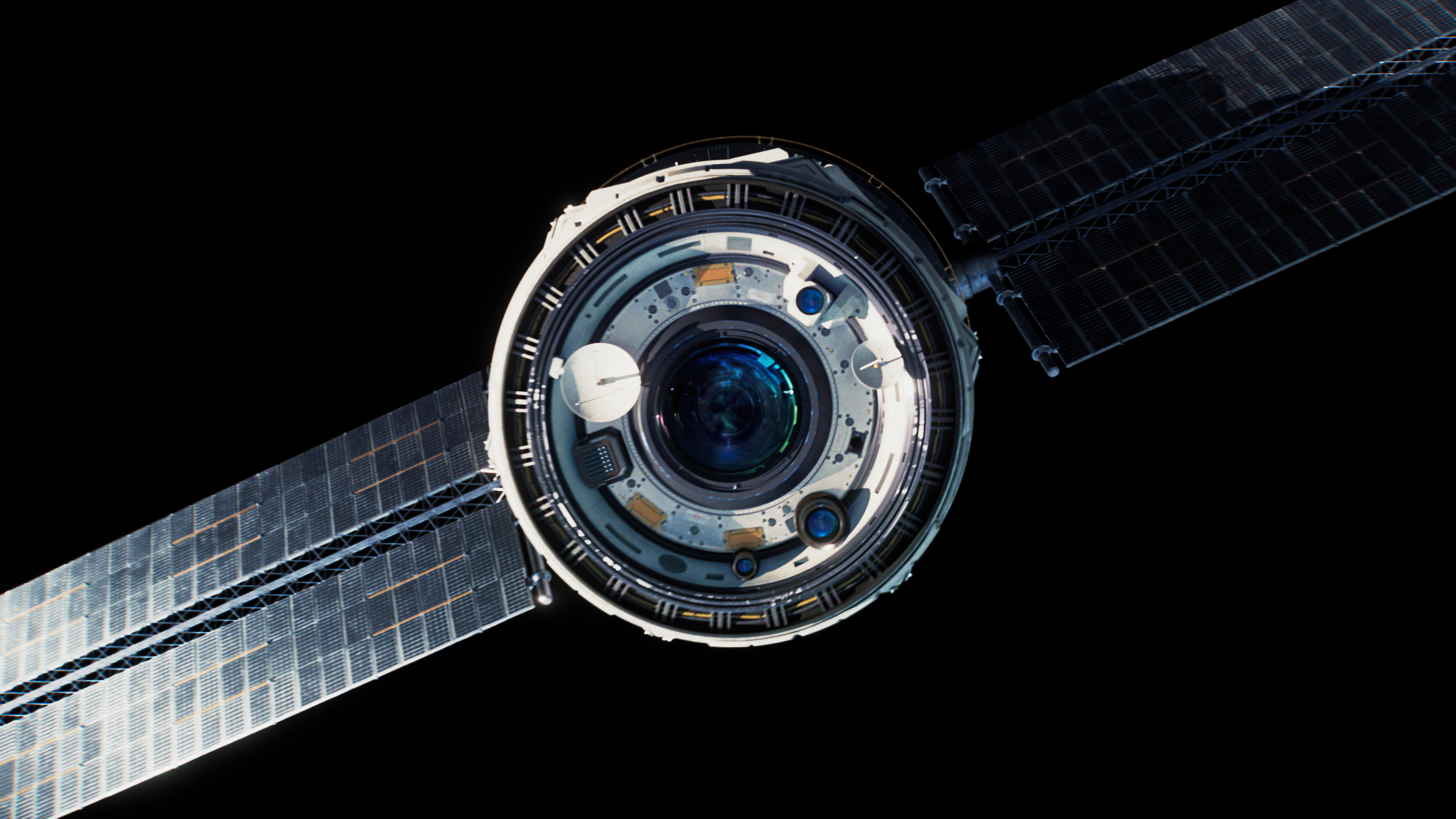
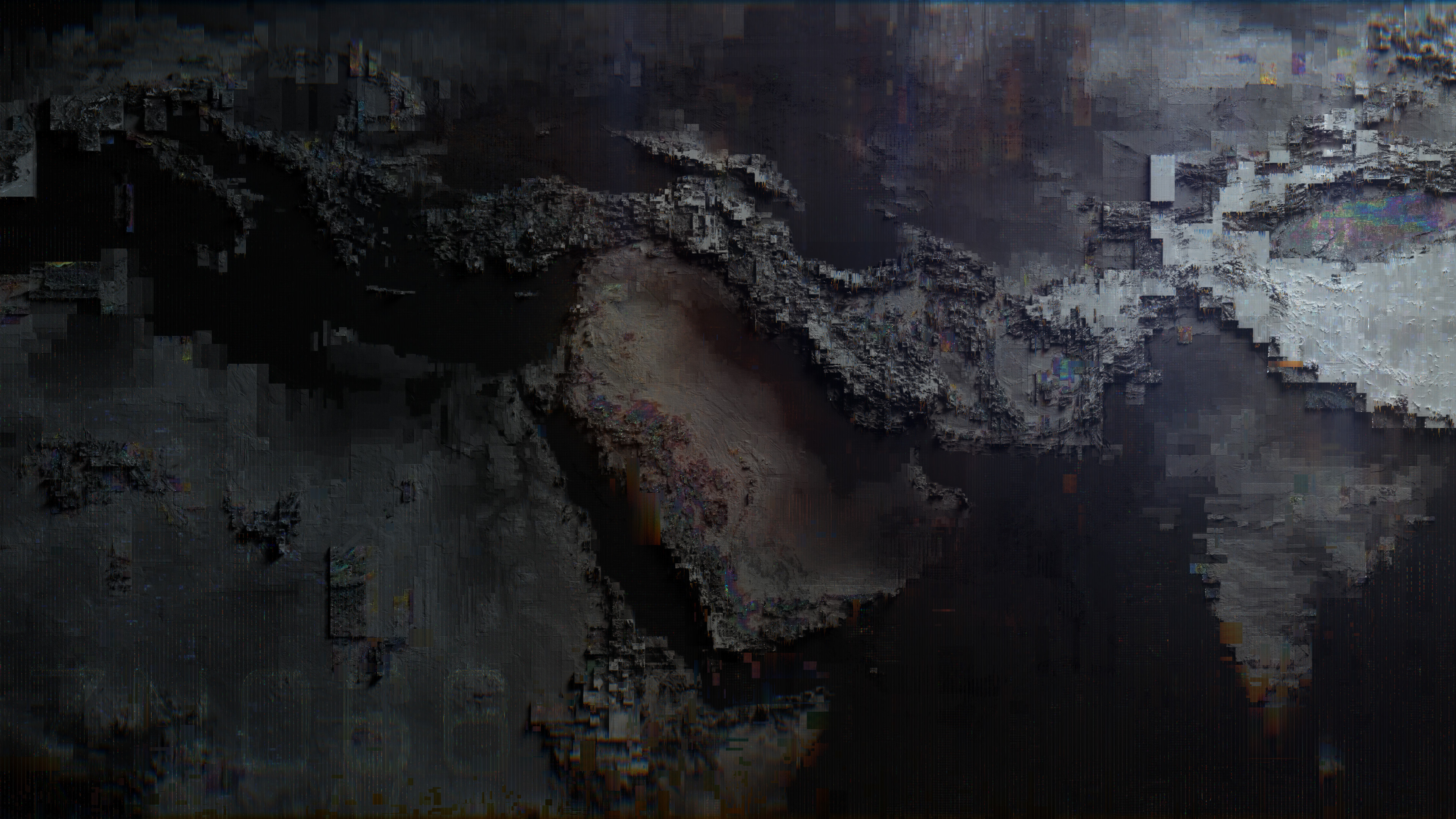
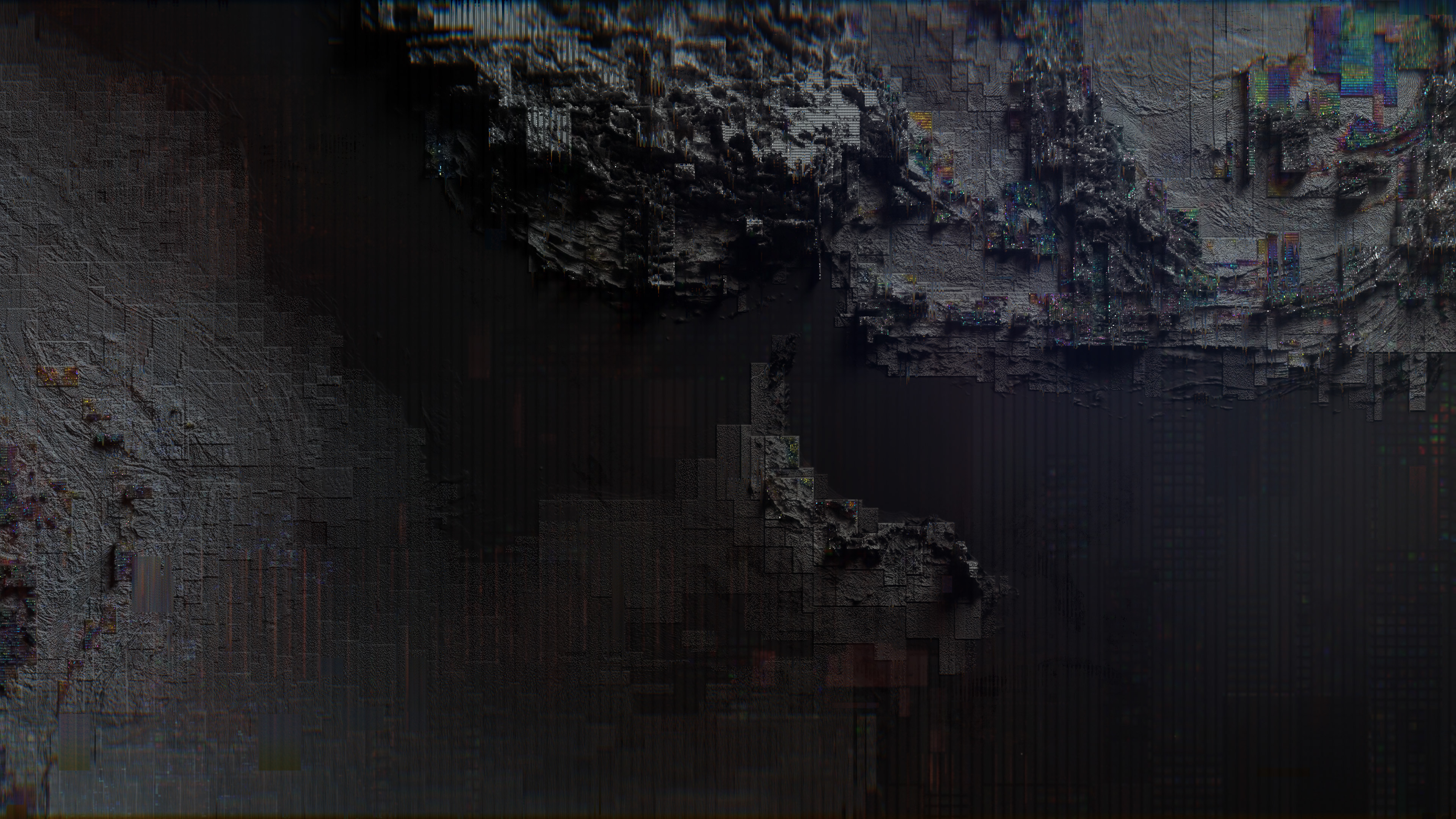
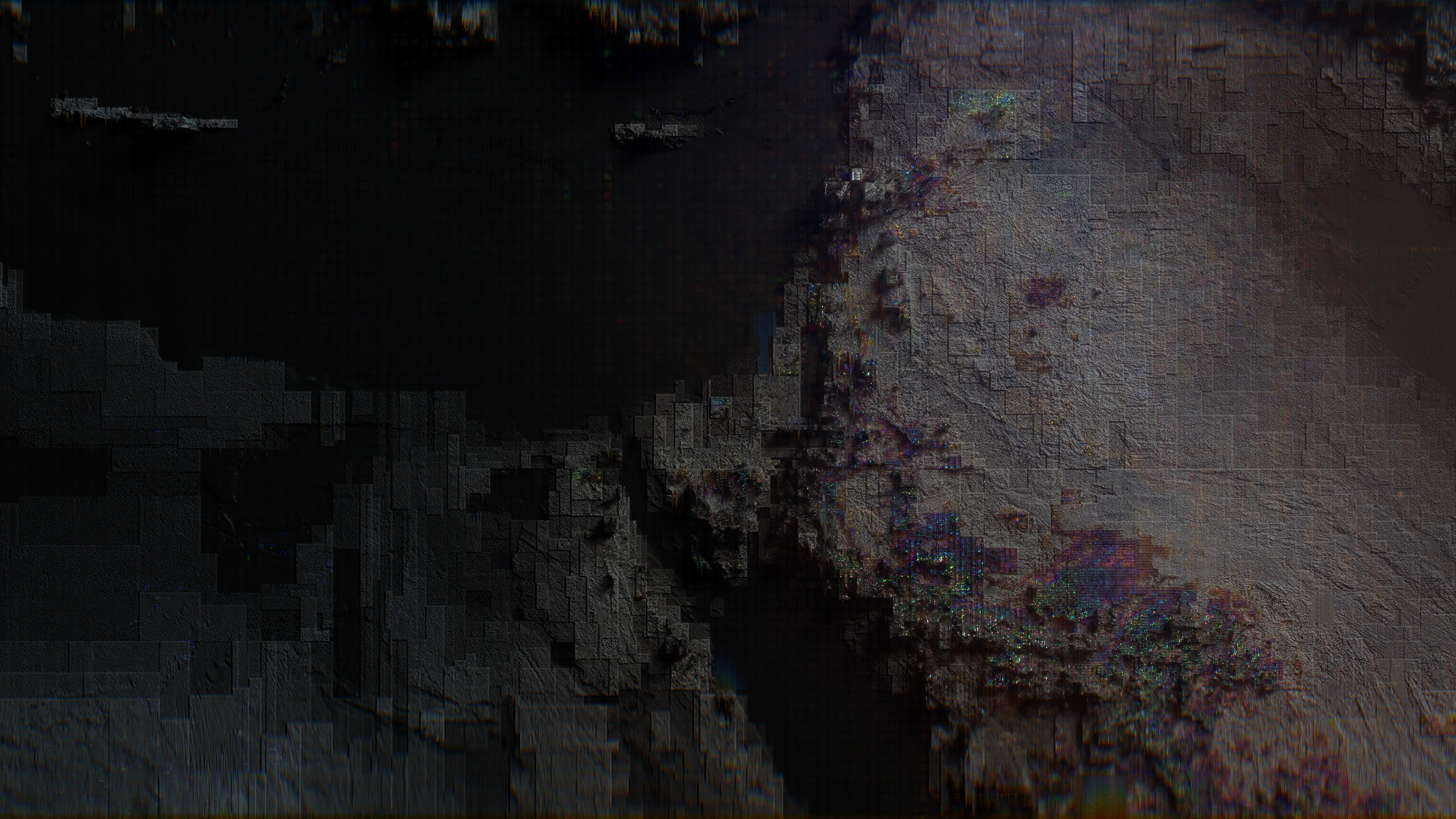
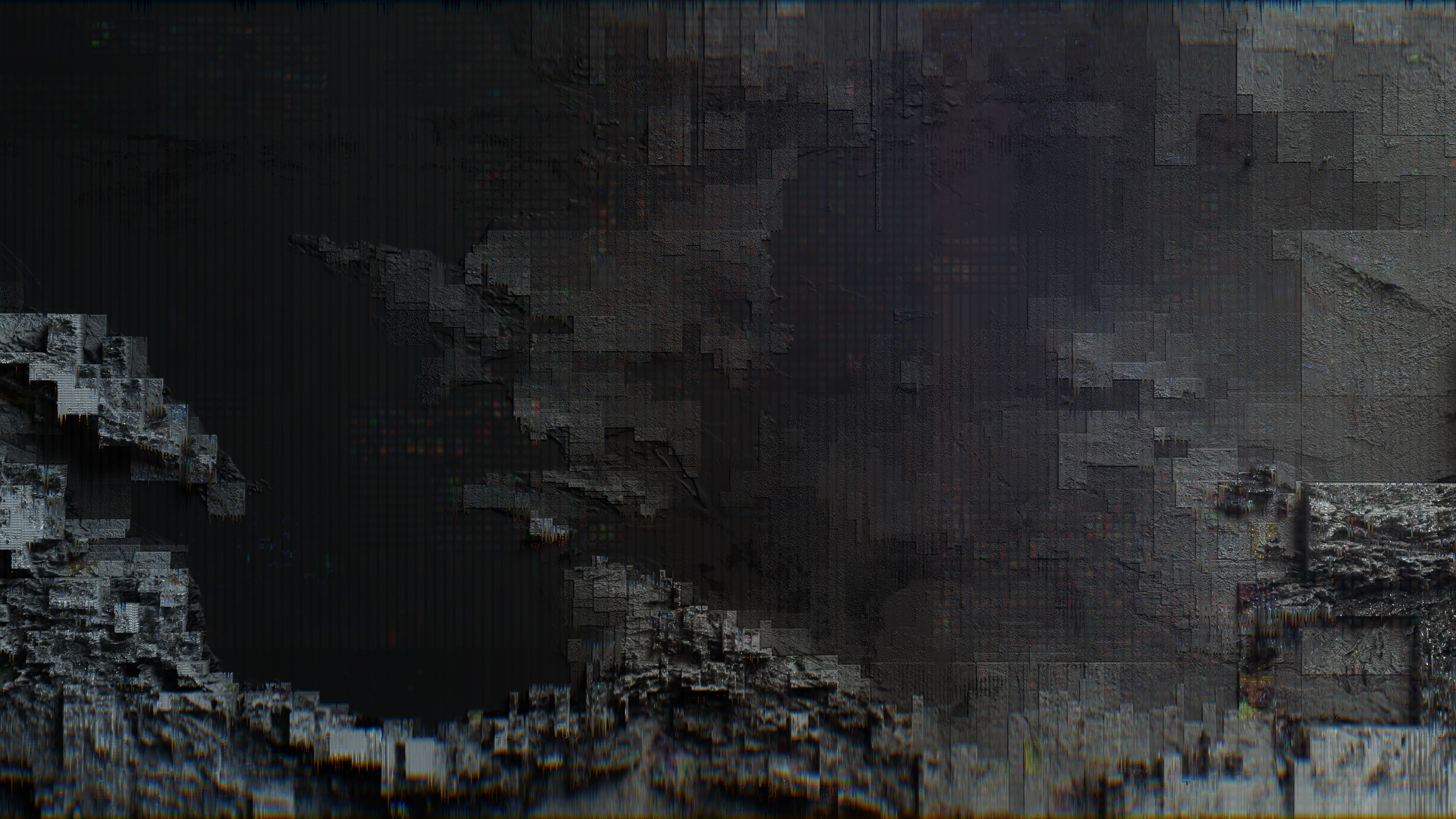
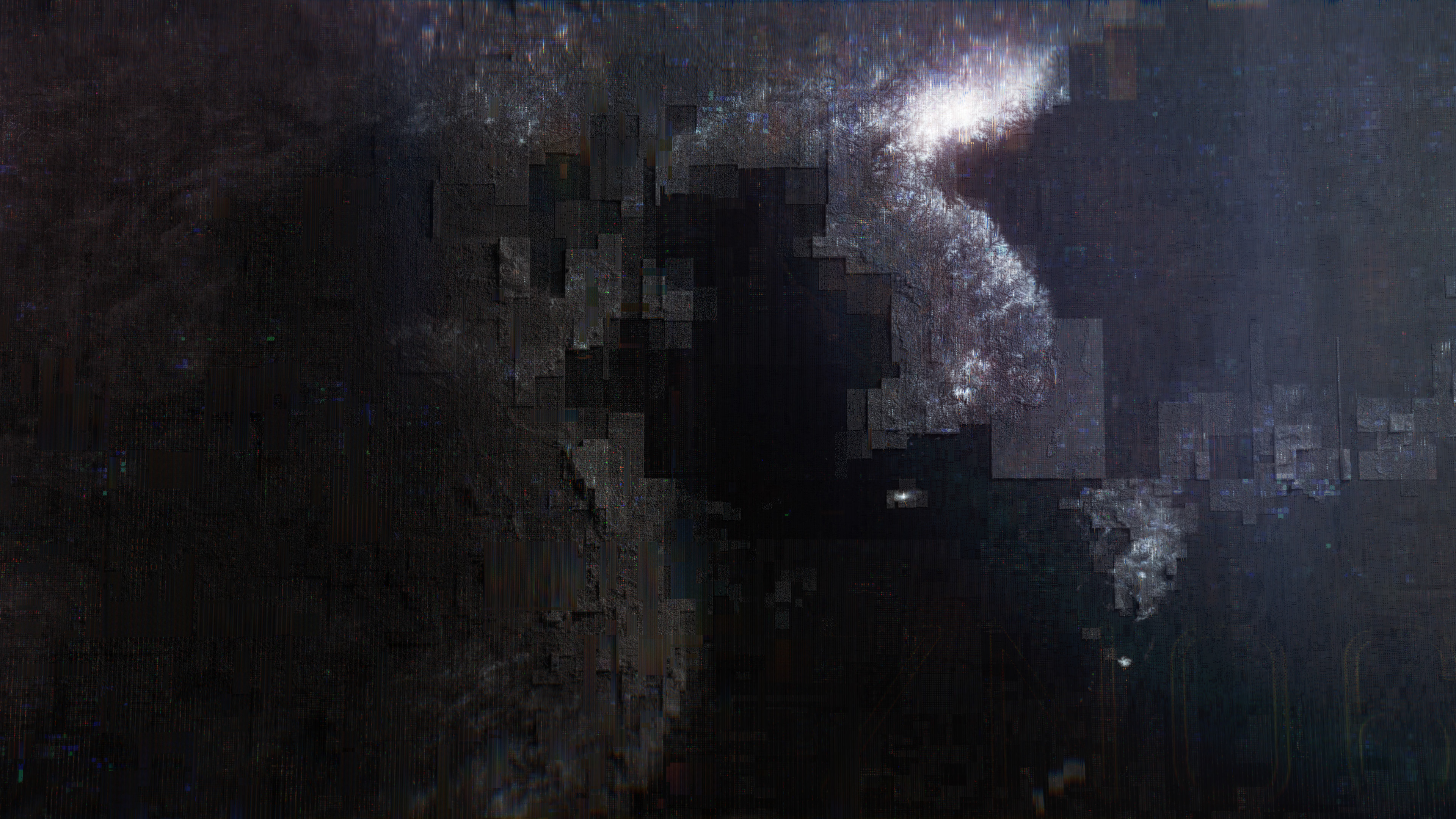
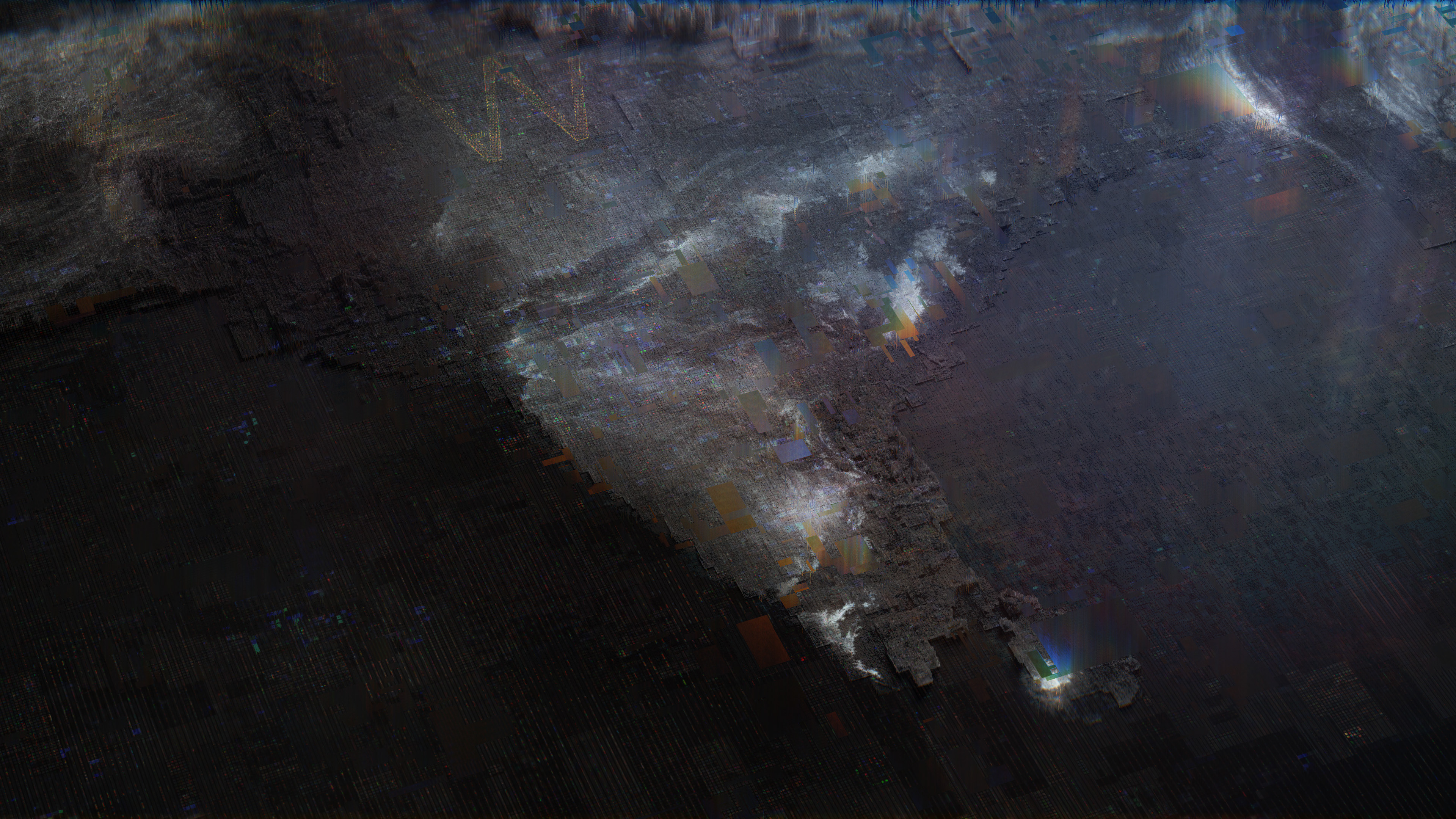
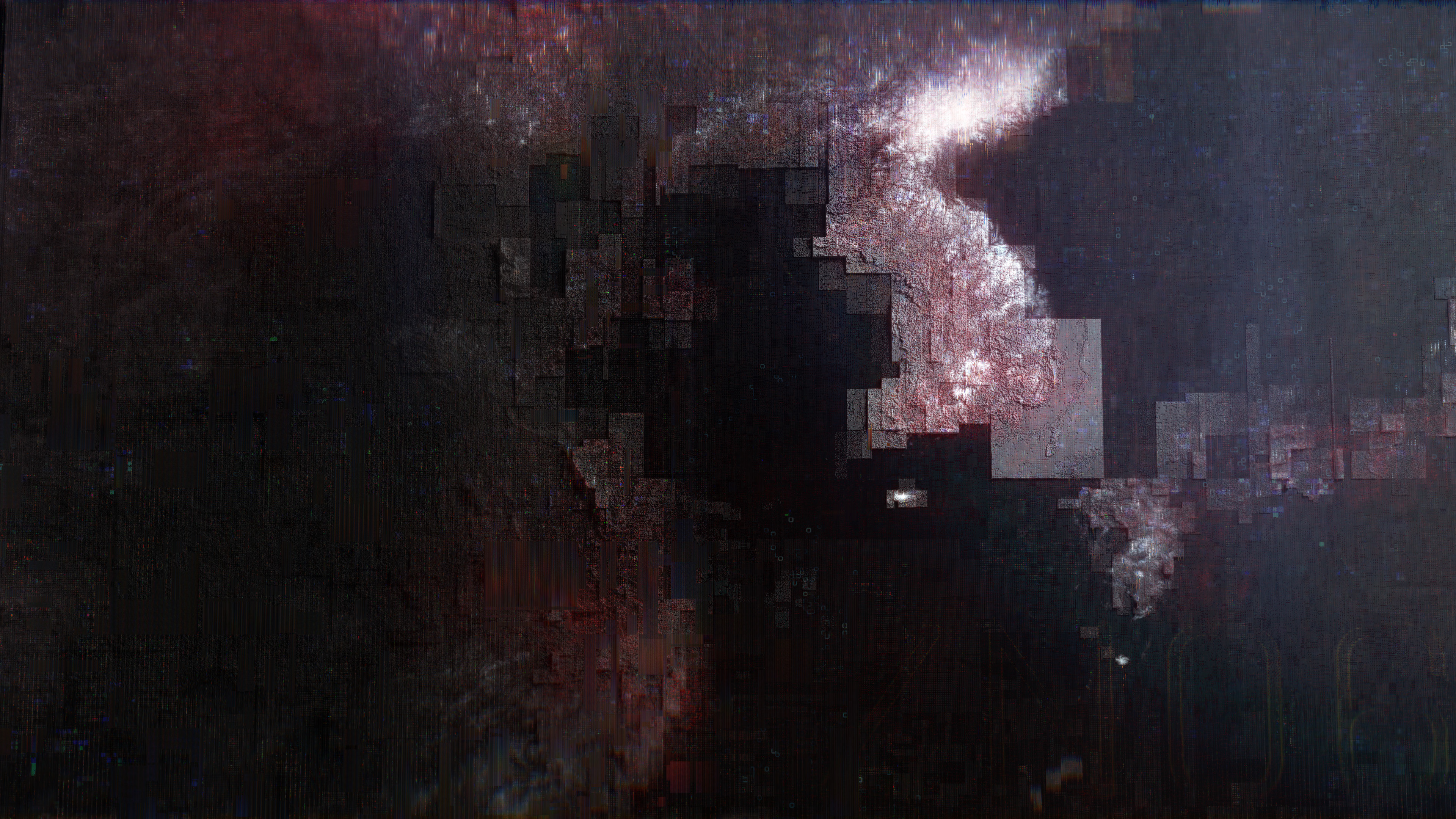
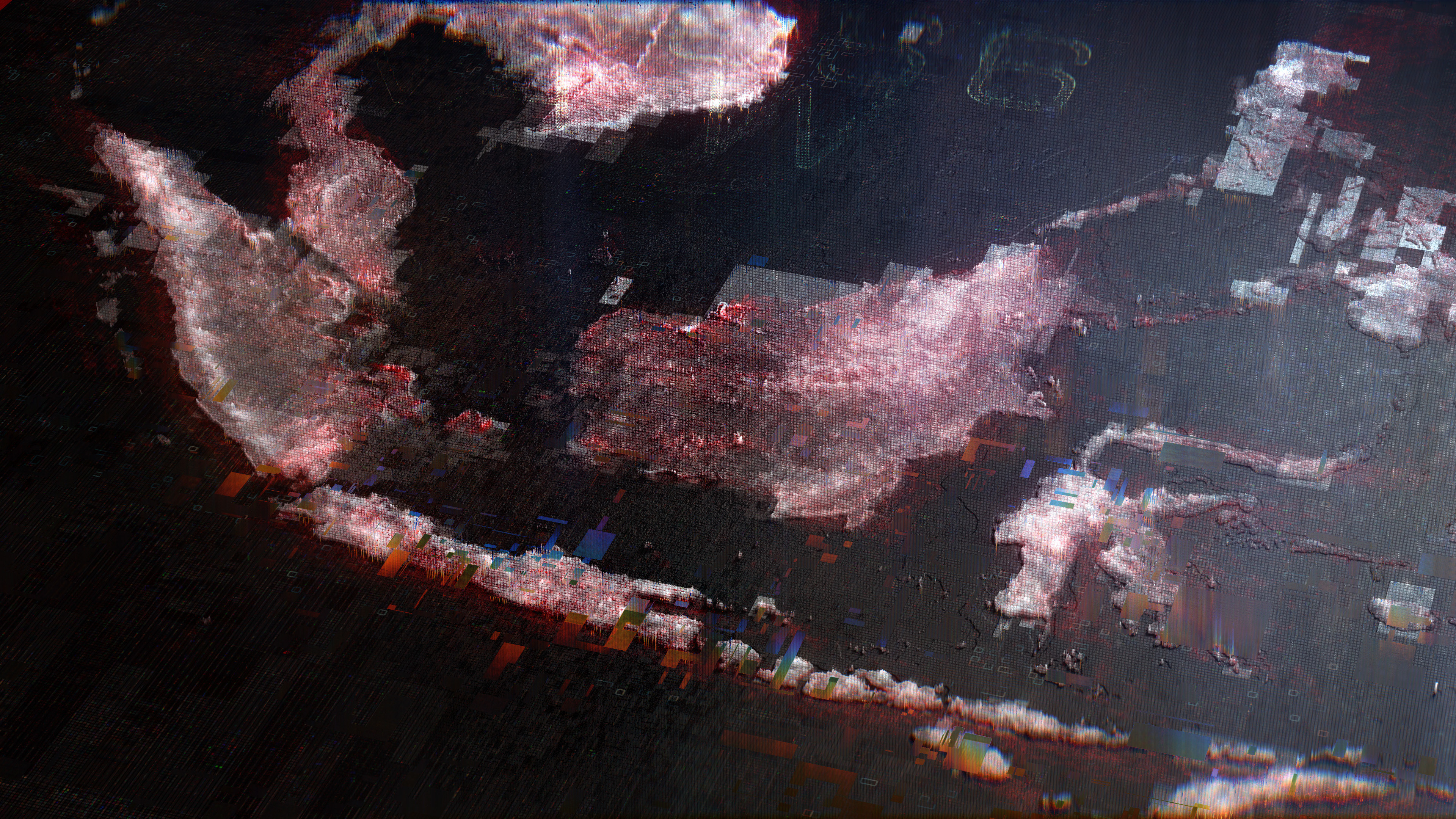
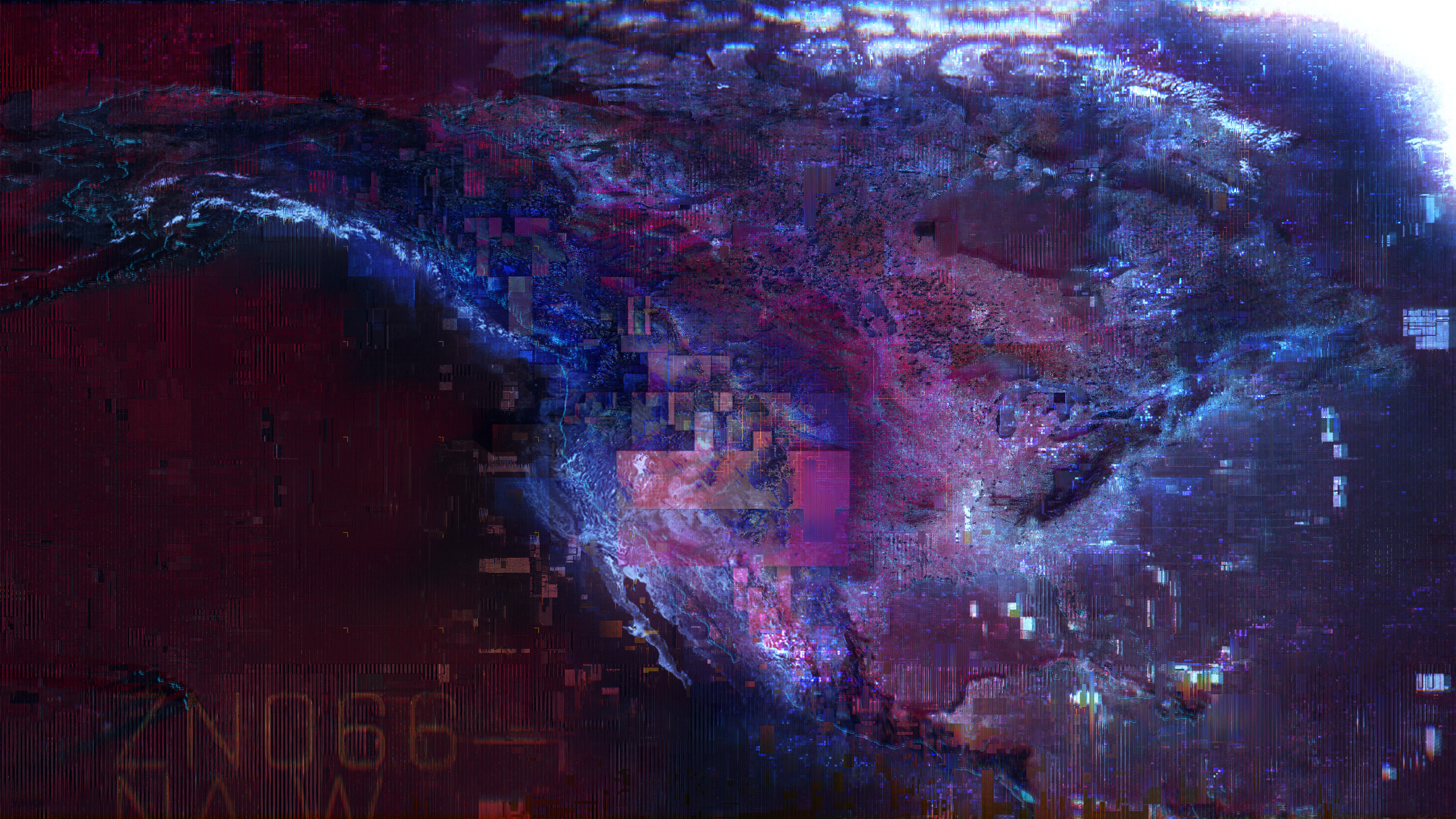
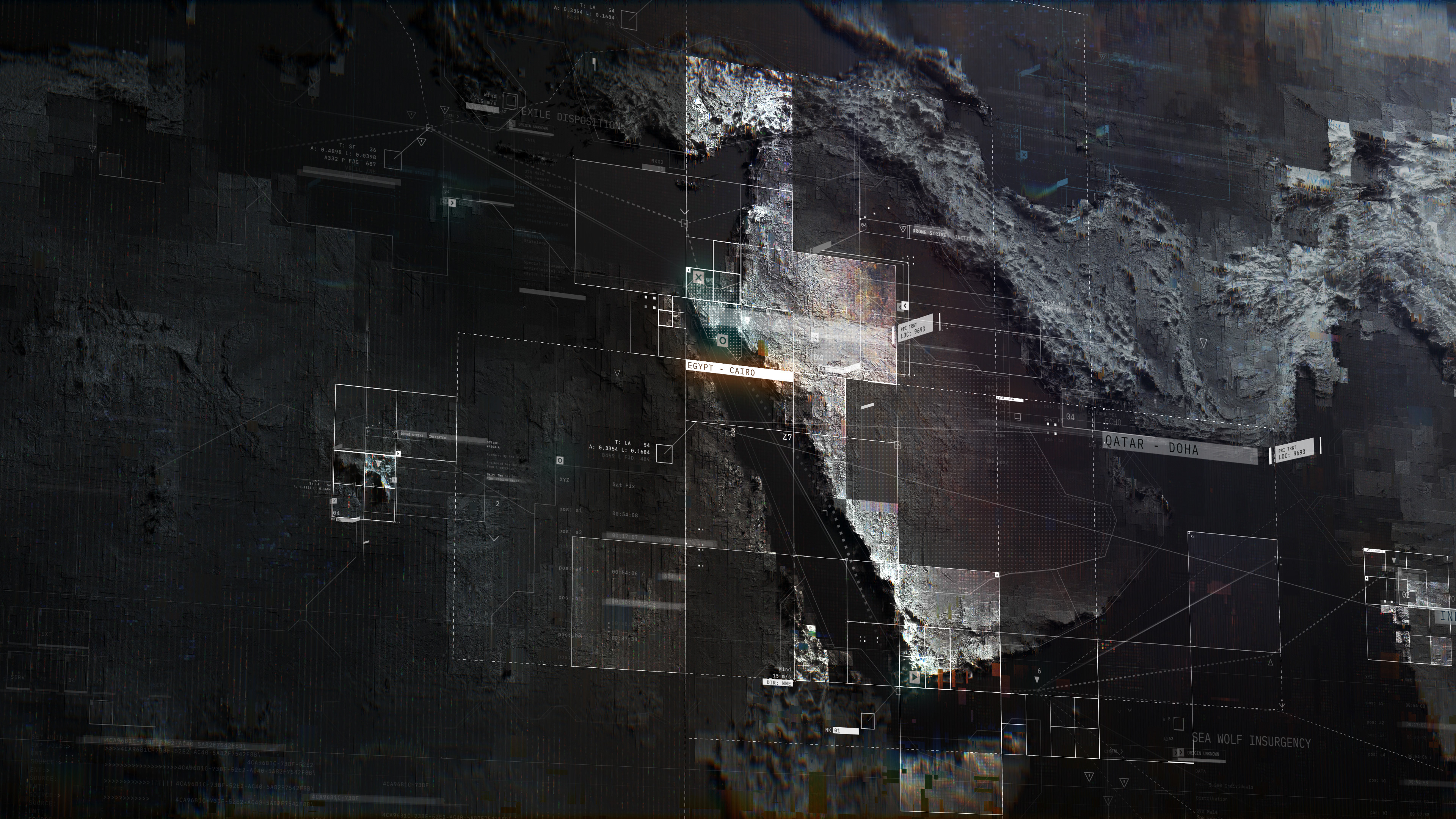
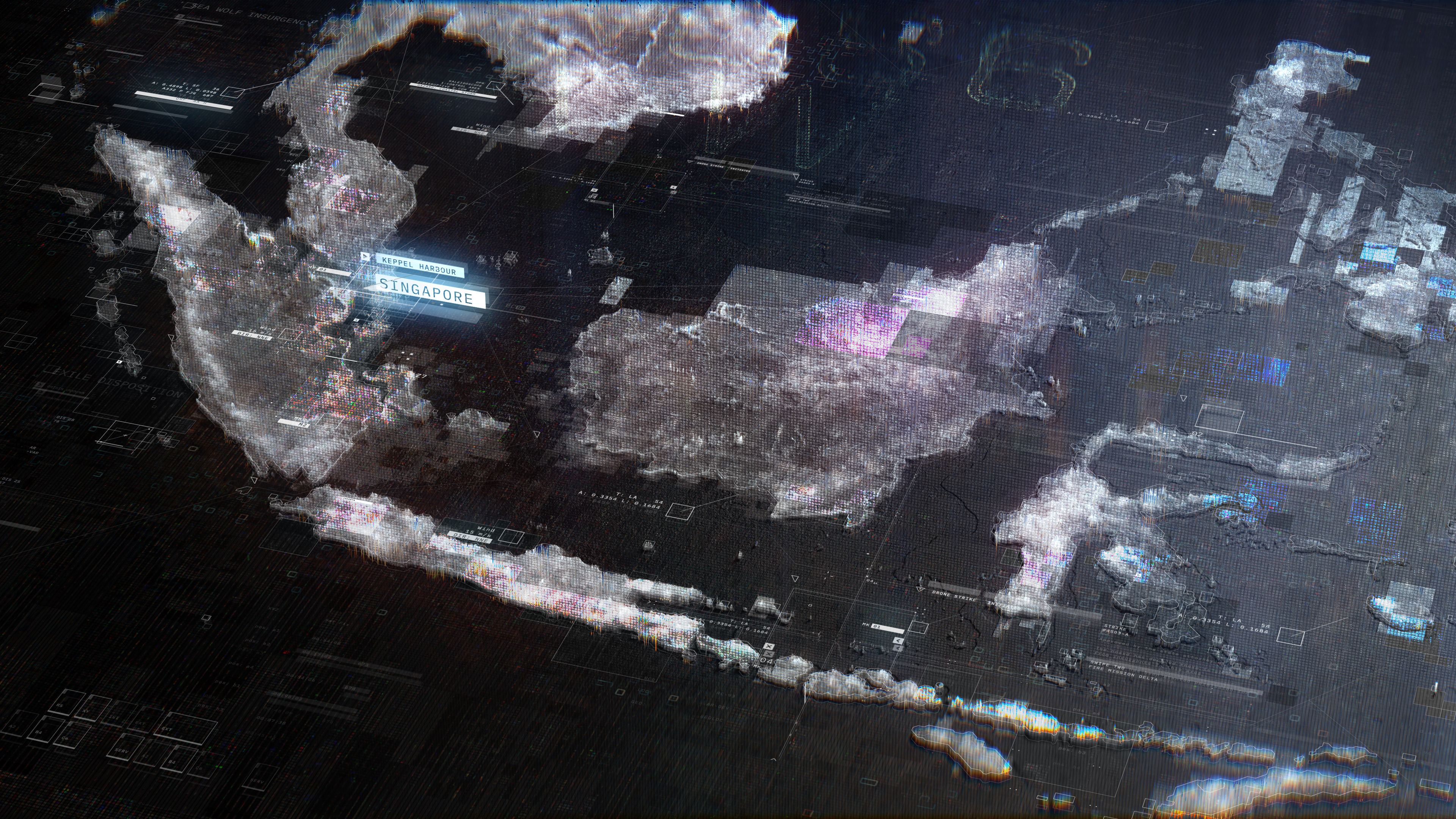
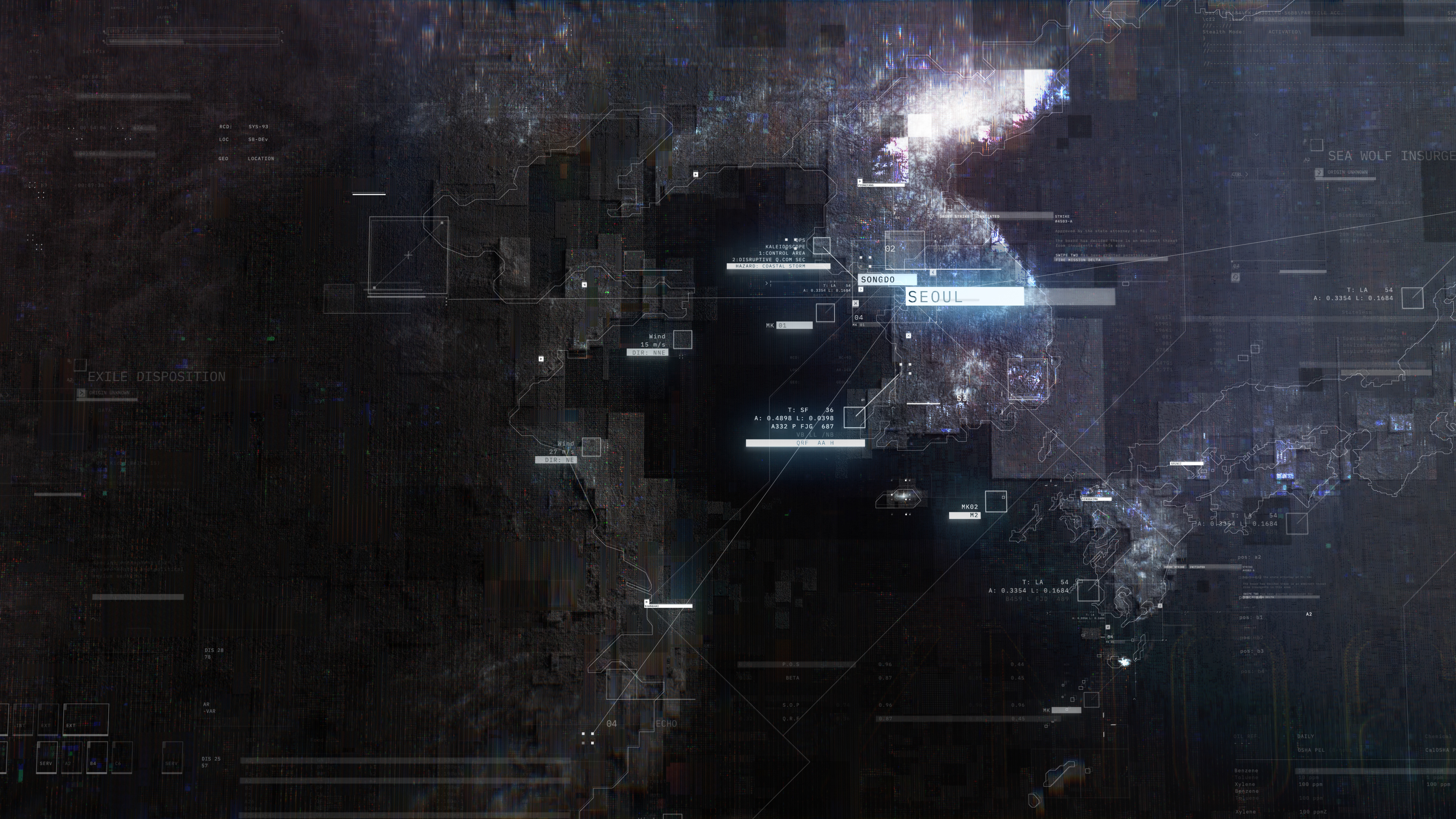
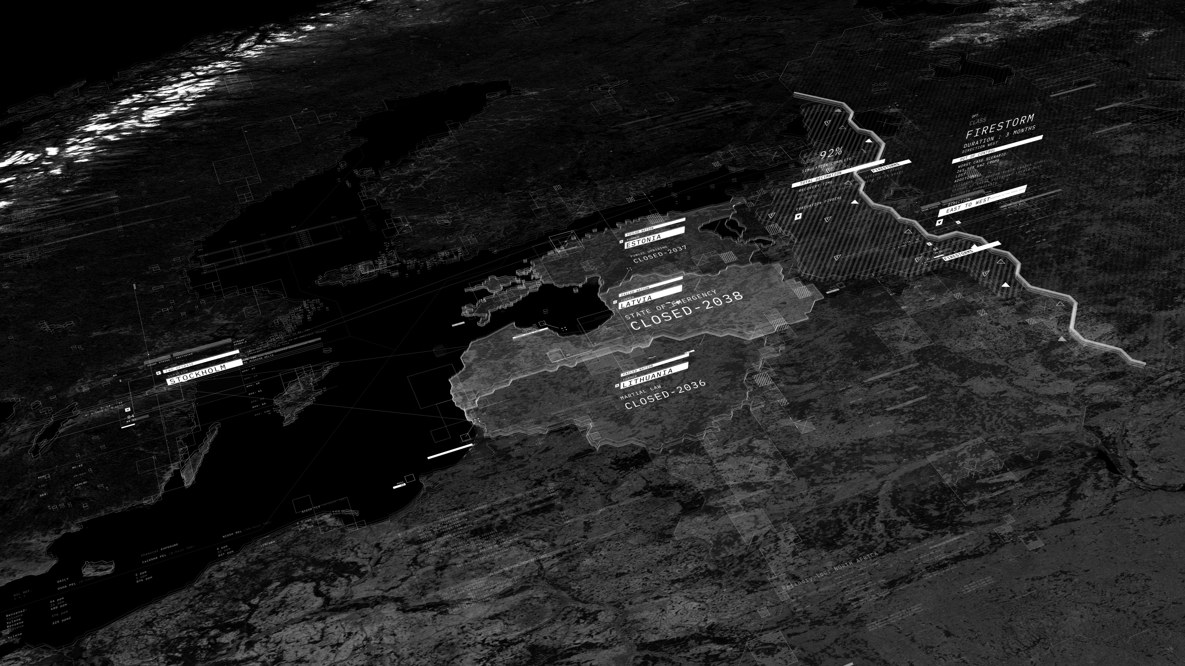
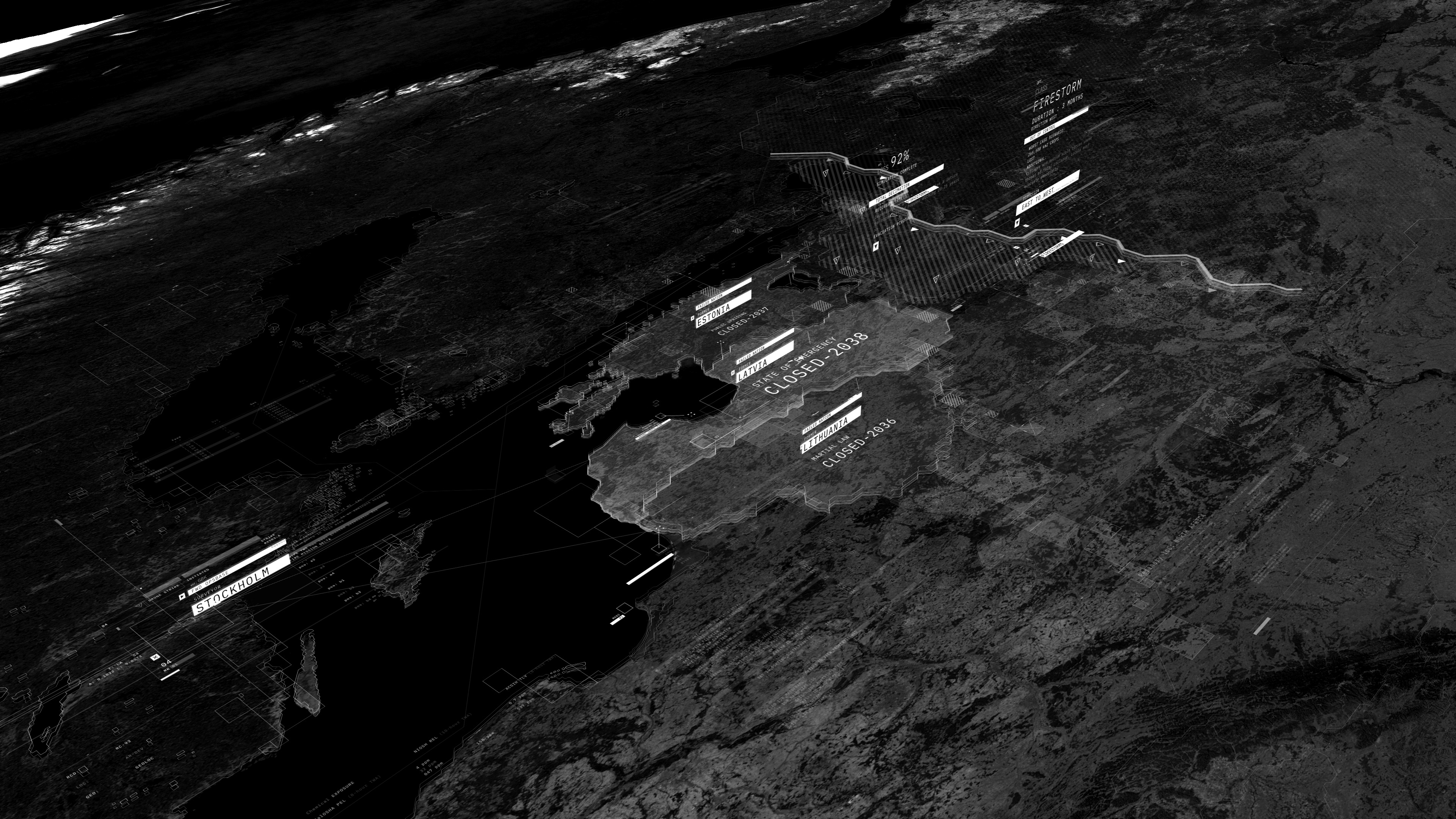
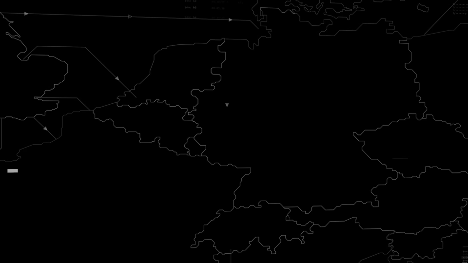
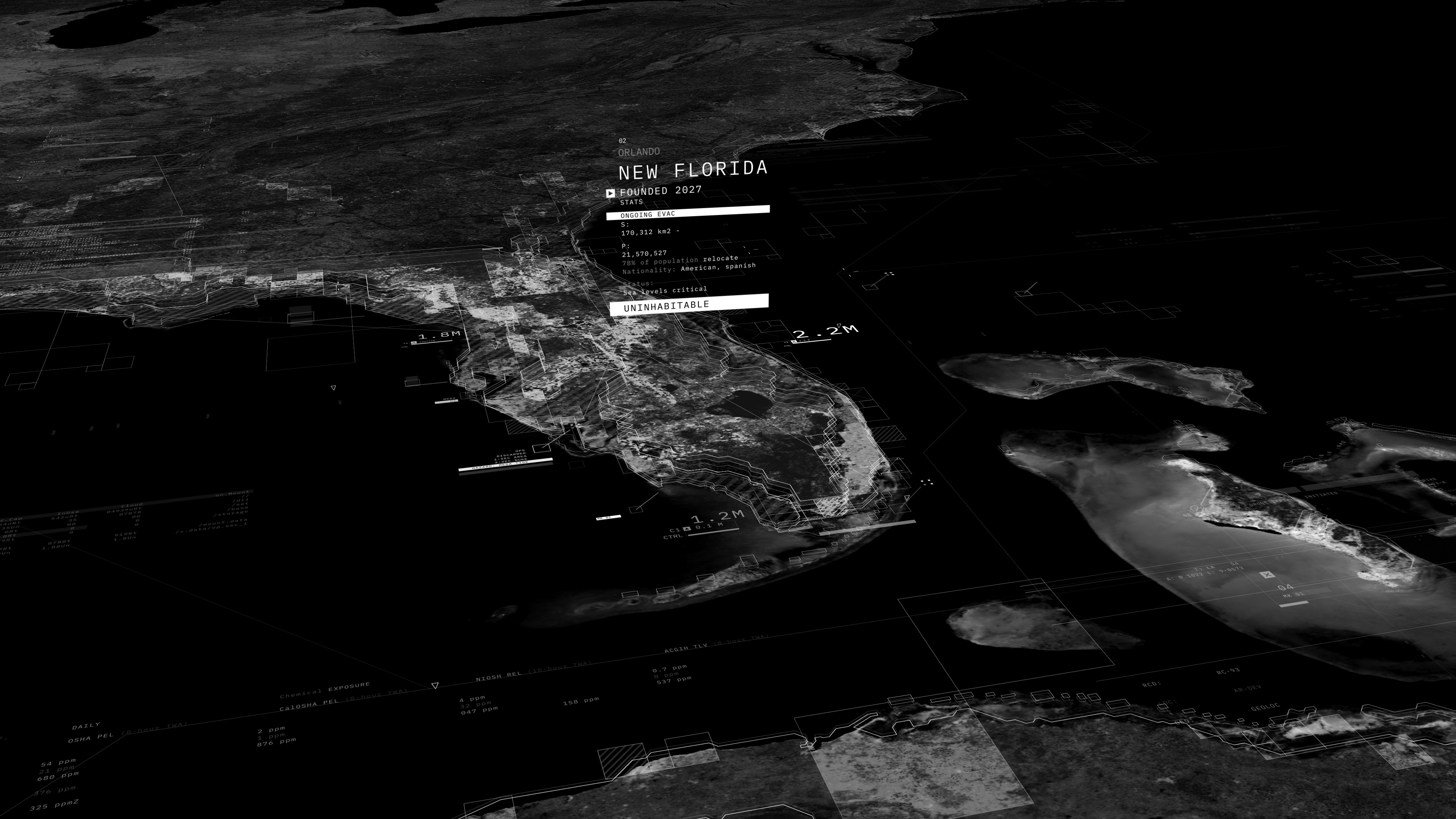
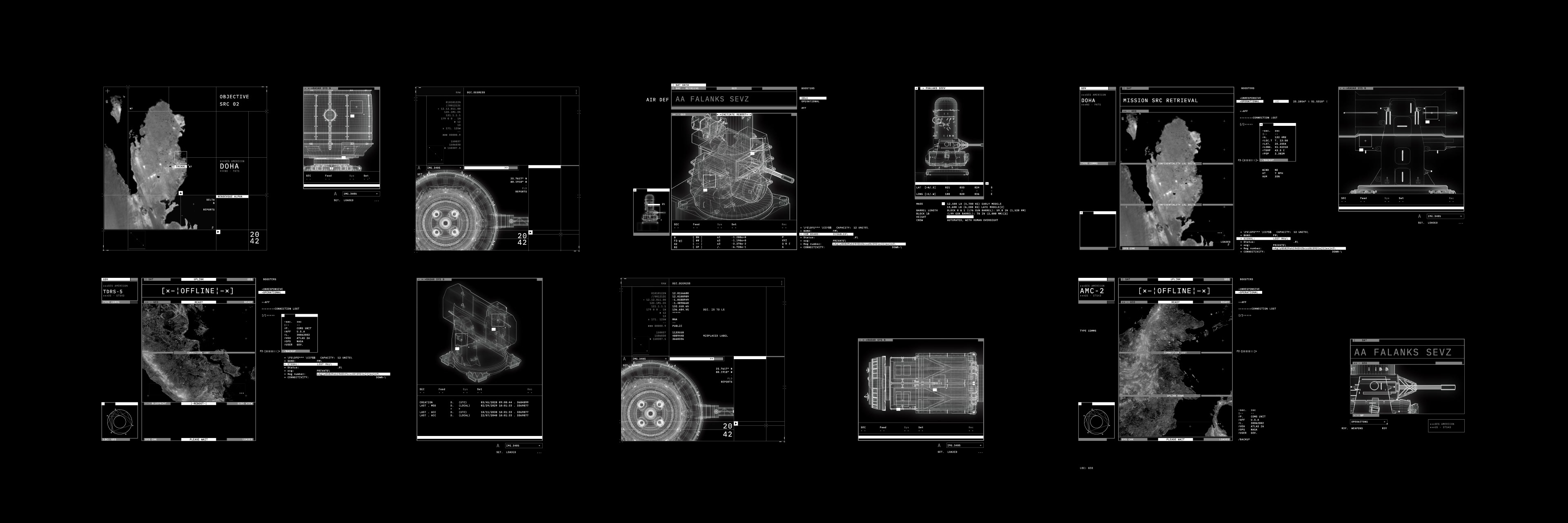
TOPOGRAPHIC MAP DESIGN
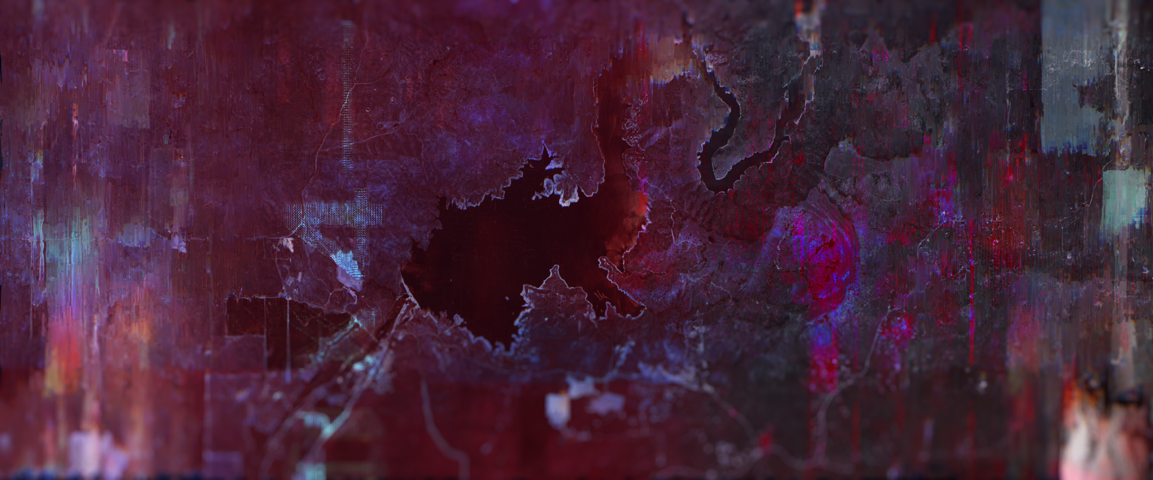
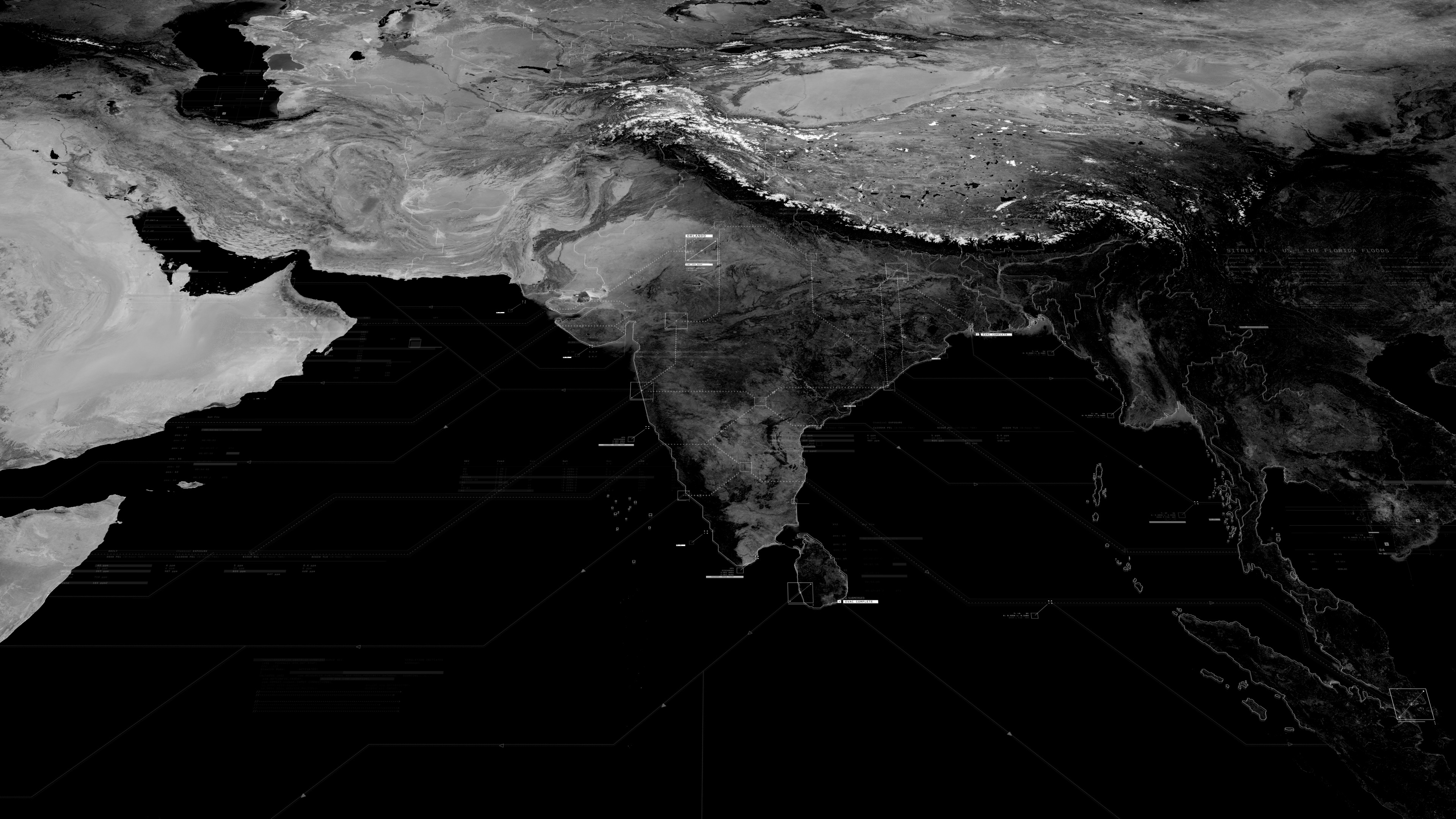
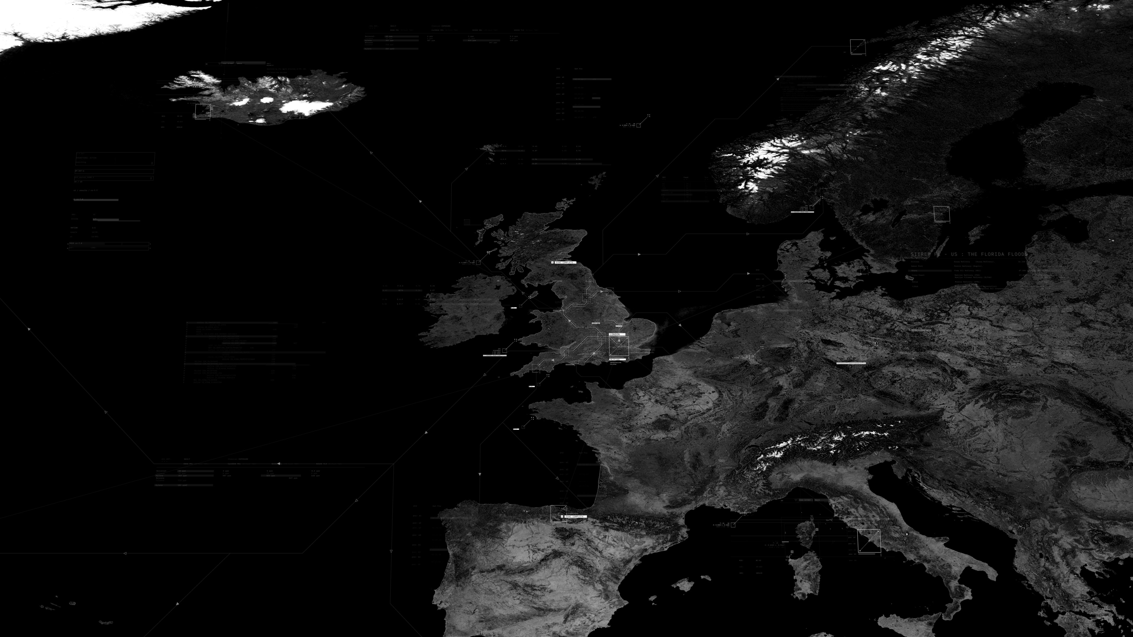
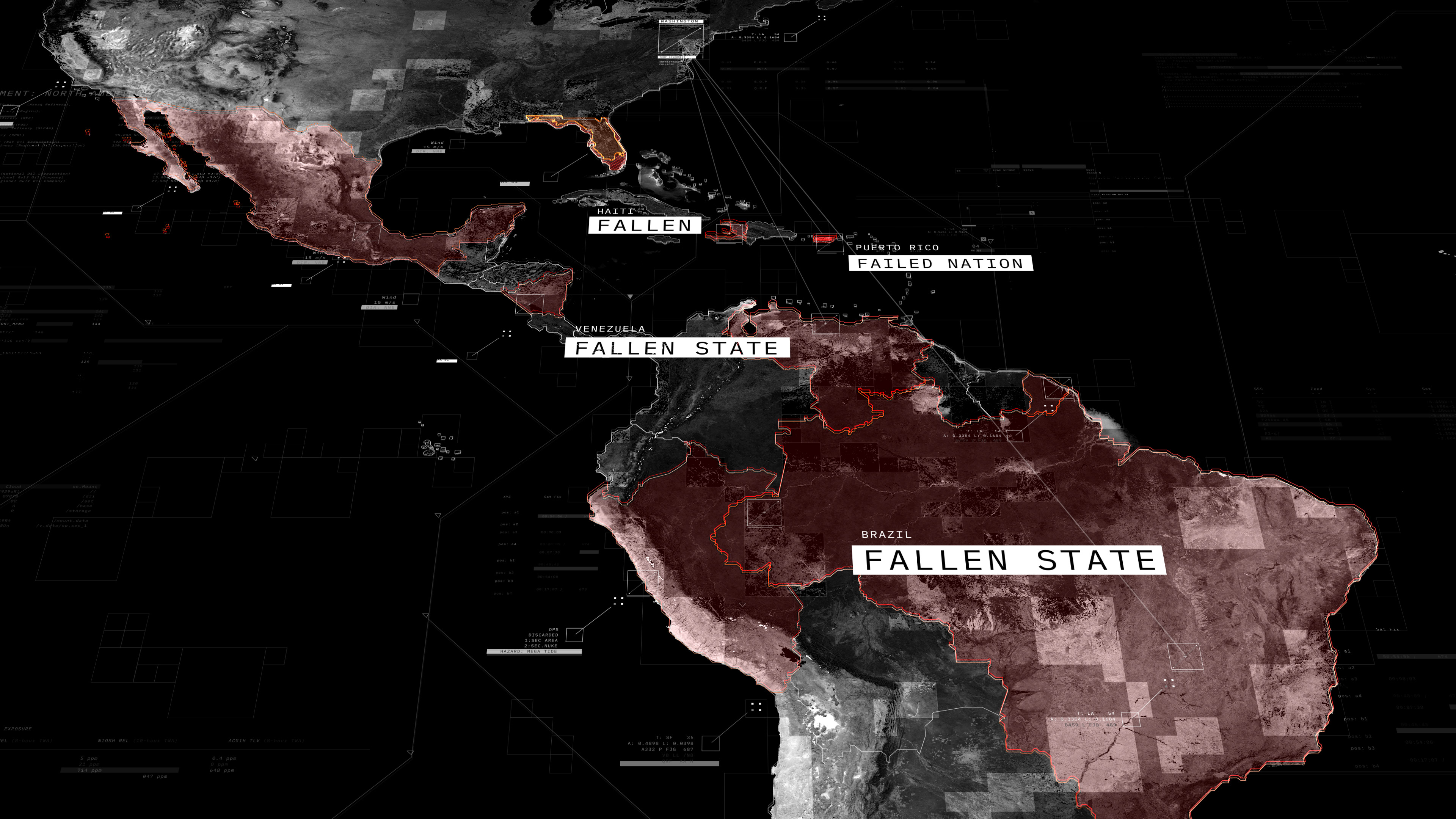
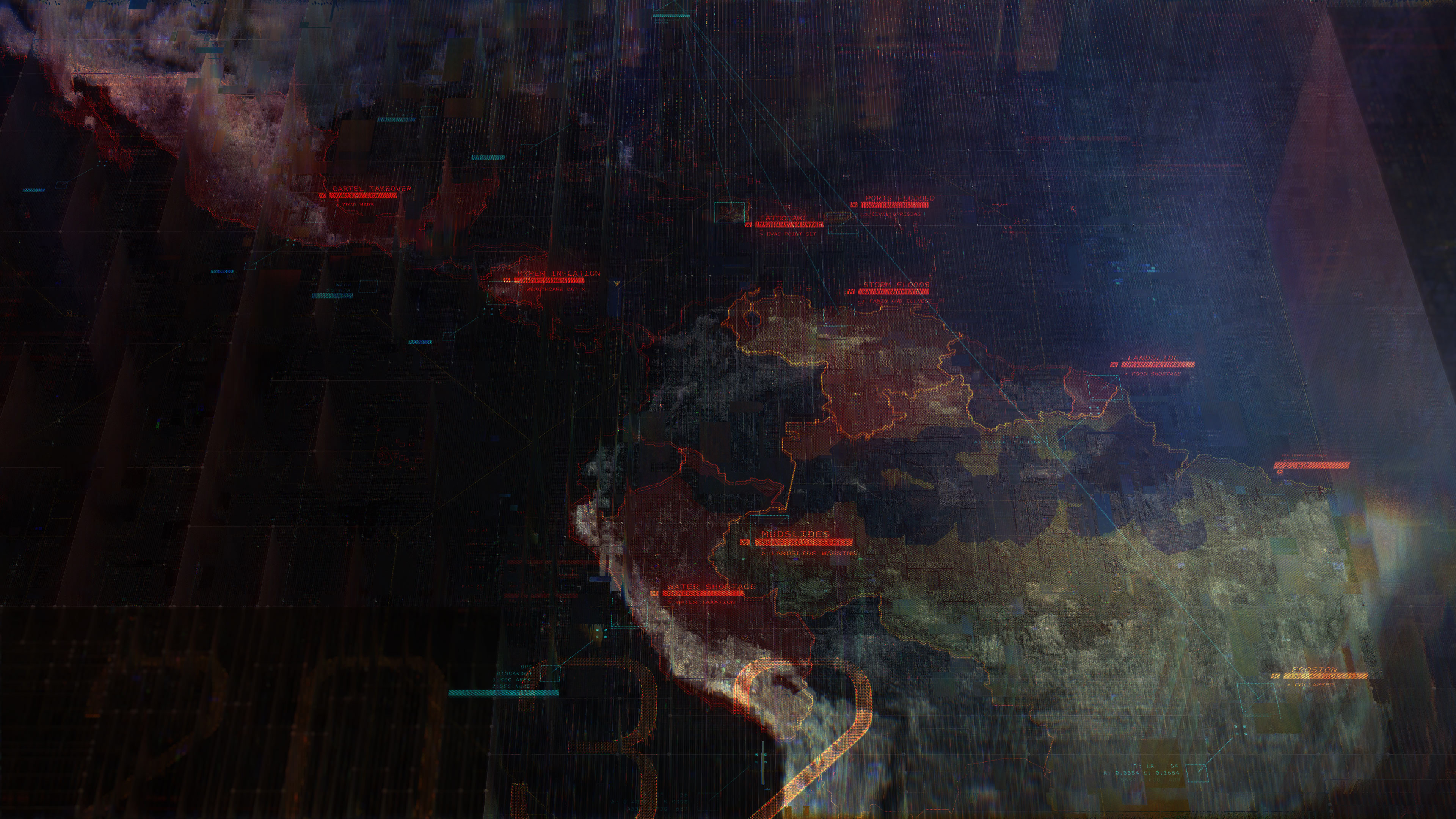
The ubiquity of maps in both our daily lives and media content make them one of the most difficult graphics to innovate on. Our challenge was to create a visualization that would feel custom to the digital world we were creating while also being immediately recognizable. For this, we leveraged the recursive grid techniques that were developed for our glitch imagery to create the geographic base layer for our map scenes. The impression is that you are viewing a specific region but upon closer inspection, it becomes apparent the image is generated from a subdividing system of blocks.
____


____
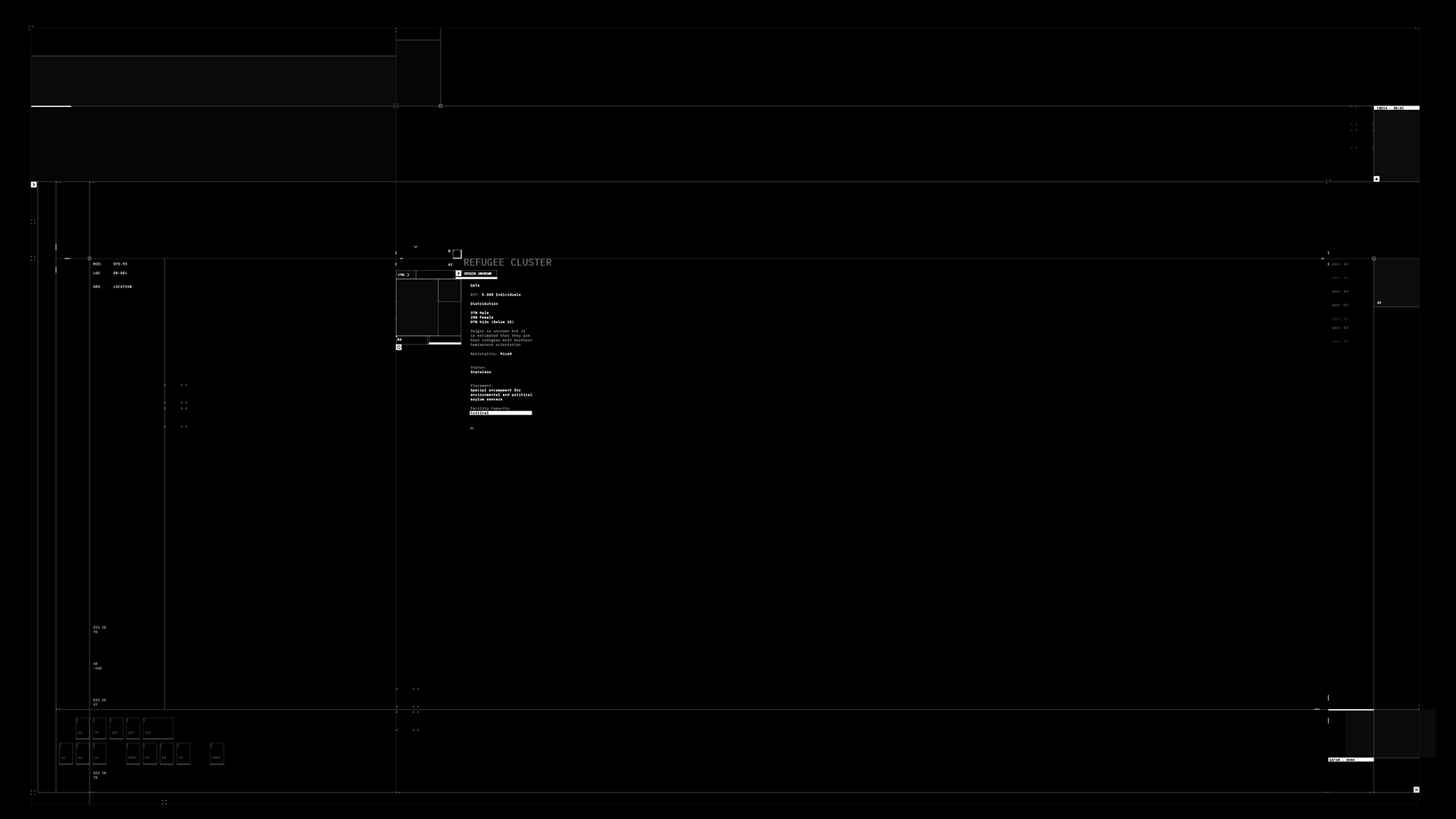
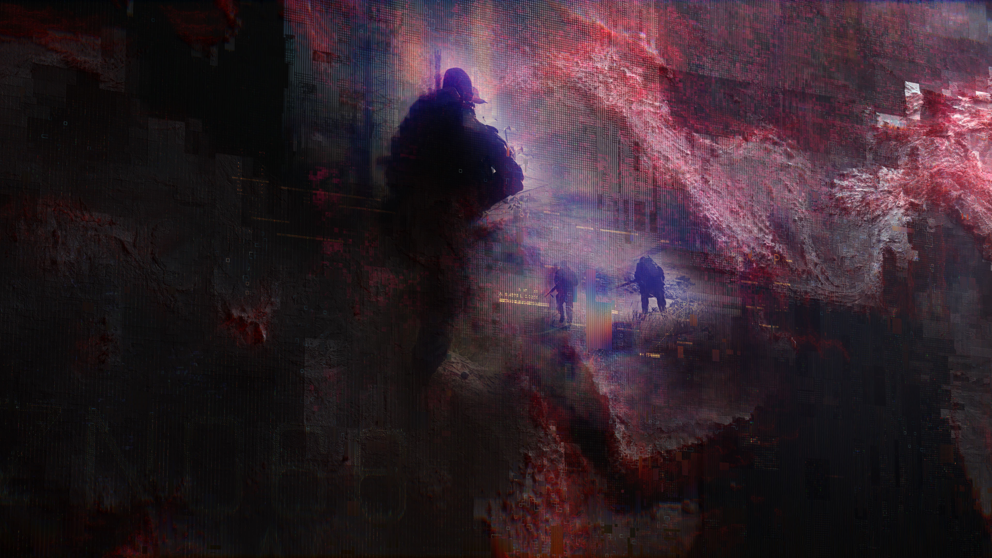
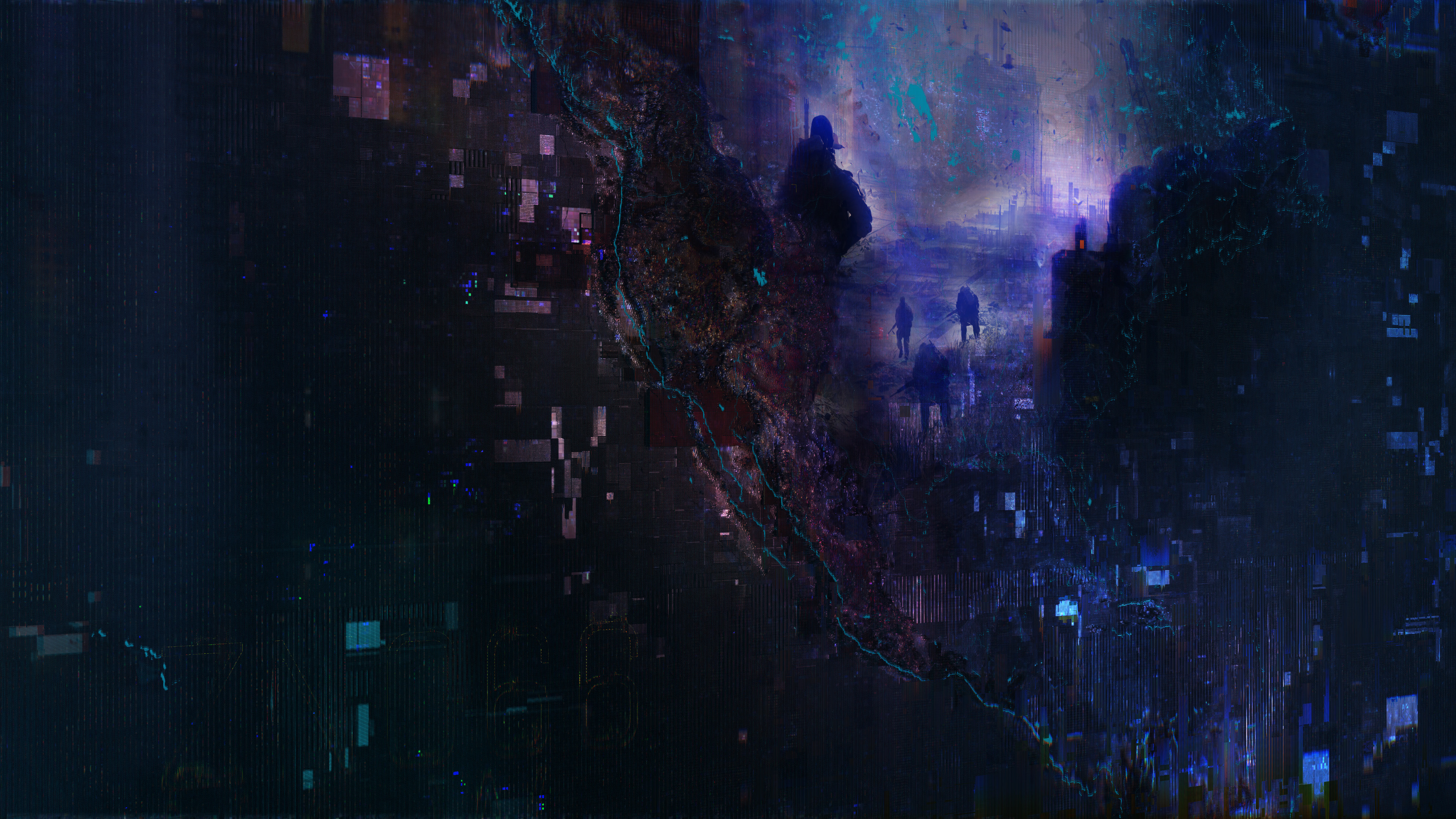
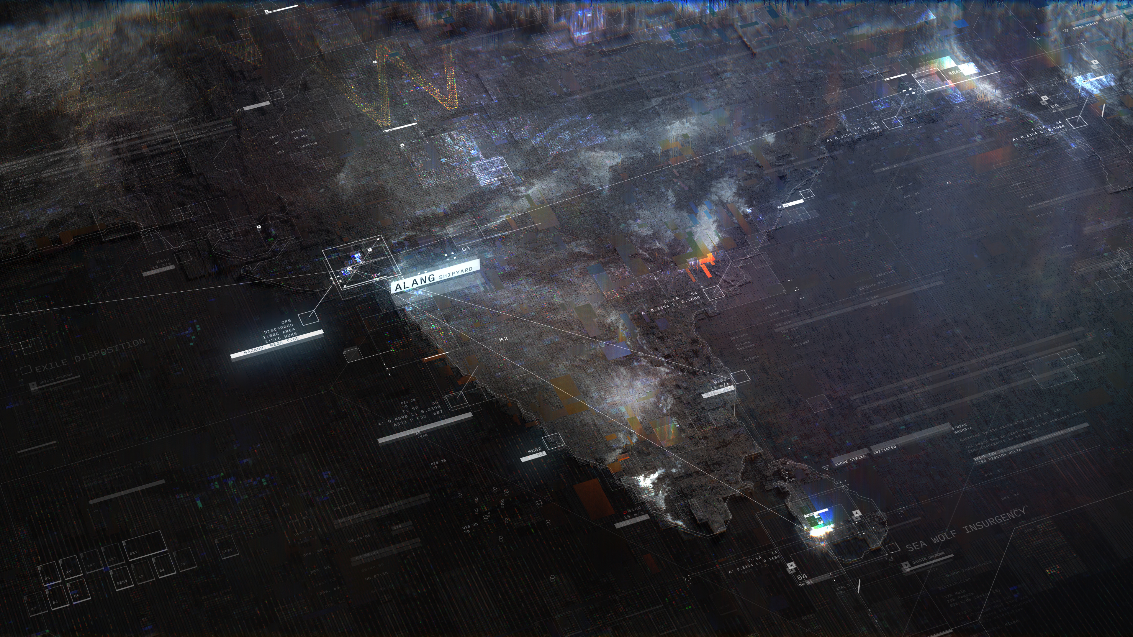
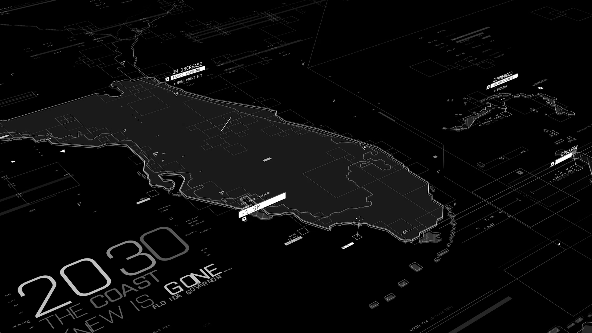
ROLE OF UI
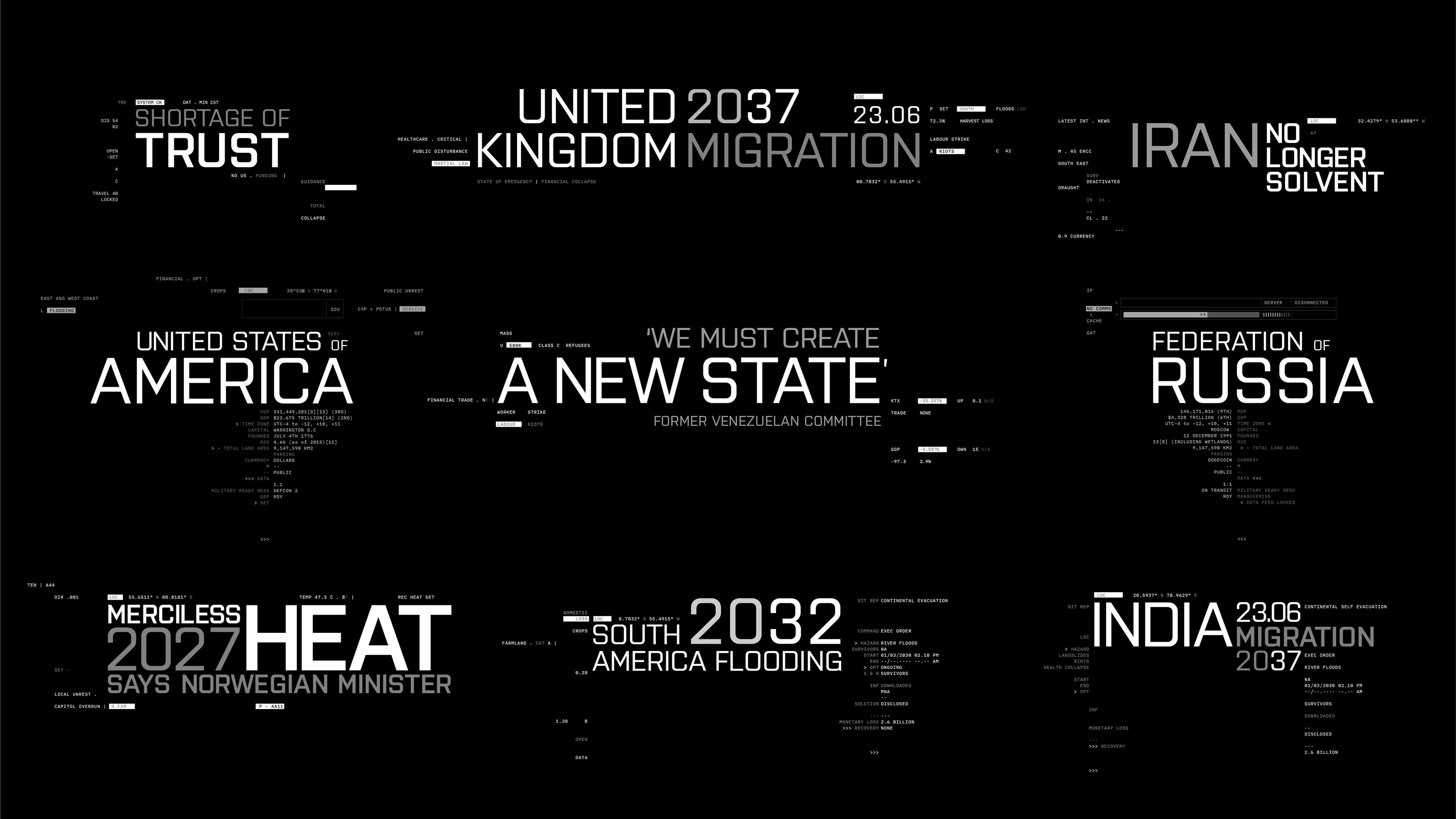
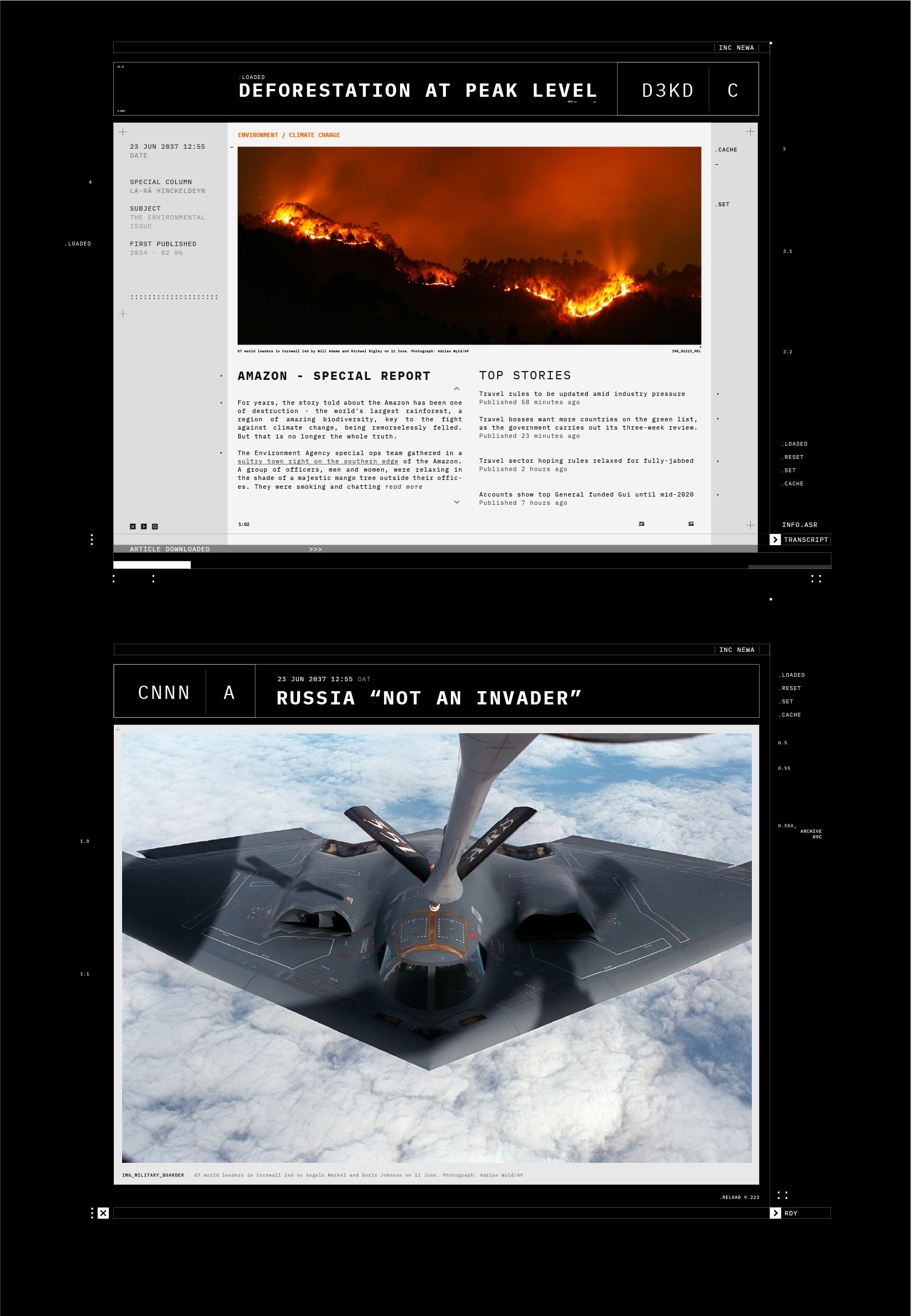
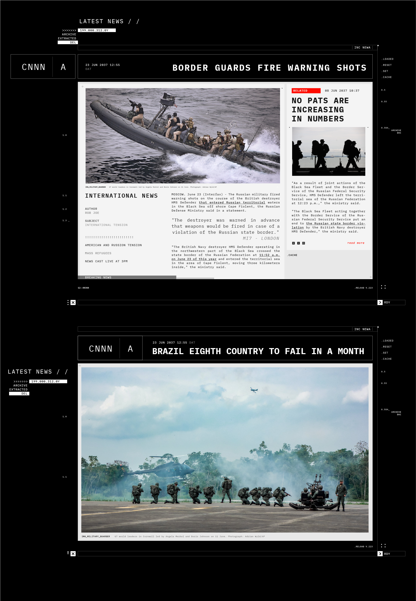
The interface elements supplied context to the narrative’s primary story points while creating intricate detail and texture in our composition. Sea level rise, shipping routes, evacuation paths, infrastructure development, situation reports and weather data was combined with militaristic mission objectives, terminal data, waypoints, hidden intel and mission briefings. All these things were largely non-readible upon first watch, but those who stopped and inspected the details would discover layers of a deeper narrative.
____


____
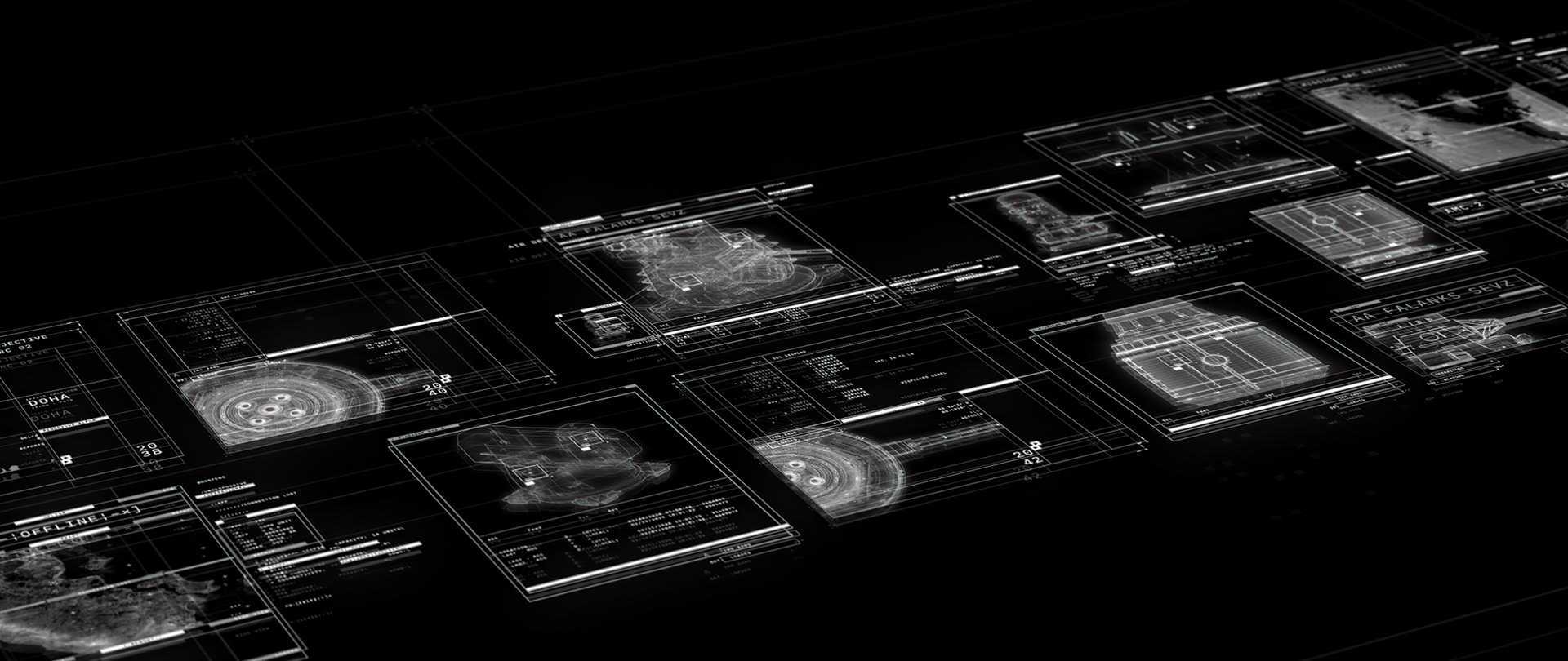
INTERFACE IN THE NETWORK
The network required a UI grid system that would provide structure to our glitched footage and voxels. These grids could contain headlines, tags and timestamps to create a secondary read for the viewer. In keeping with the events in the story, the interface would breakdown during the blackout incident.
____


____
The headline typography communicated the primary events in our timeline. It was important that the viewer could identify where the film was situated in time as we progressed from current day to the events of 2042.
____


____
CREDITS | PRODUCTION
Client: Electronic Arts | DICE Stockholm | Criterion London
Production: Goodbye Kansas
Executive Producer: Anton Söderhäll
Producer: La-Râ Hinckeldeyn
Score: Hildur Guðnadóttir & Sam Slater
Sound Design: UHORT
CREDITS | MOTION GRAPHICS
Art Director | Lead Design: Michael Rigley
Lead UI Design: Steven Bussey
3D Animation: Michael Rigley, Will Adams
Lead Glitch Animation: Guilherme Ferreirinha
2D Animation: Michael Rigley, Guilherme Ferreirinha, Marcus Melin
UI Animation: Steven Bussey
2D Animation: Michael Rigley, Guilherme Ferreirinha, Marcus Melin
UI Animation: Steven Bussey
____